
 Theo
Theo


Theo is an abstraction for transforming and formatting Design Tokens.
Looking for the gulp plugin?
As of Theo v6, the gulp plugin is distributed as a separate package: gulp-theo.
Example
# buttons.yml props: button_background: value: "{!primary_color}"imports: - ./aliases.ymlglobal: type: color category: buttons# aliases.yml aliases: primary_color: value: "#0070d2"const theo = ; theo ;Transforms
Theo is divided into two primary features: transforms and formats.
Transforms are a named group of value transforms. Theo ships with several predefined transforms.
| Name | Value Transforms |
|---|---|
raw |
[] |
web |
['color/rgb'] |
ios |
['color/rgb', 'relative/pixelValue', 'percentage/float'] |
android |
['color/hex8argb', 'relative/pixelValue', 'percentage/float'] |
Value Transforms
Value transforms are used to conditionaly transform the value of a property. Below are the value transforms that ship with Theo along with the predicate that triggers them.
| Name | Predicate | Description |
|---|---|---|
color/rgb |
prop.type === 'color' |
Convert to rgb |
color/hex |
prop.type === 'color' |
Convert to hex |
color/hex8rgba |
prop.type === 'color' |
Convert to hex8rgba |
color/hex8argb |
prop.type === 'color' |
Convert to hex8argb |
percentage/float |
/%/.test(prop.value) |
Convert a percentage to a decimal percentage |
relative/pixel |
isRelativeSpacing |
Convert a r/em value to a pixel value |
relative/pixelValue |
isRelativeSpacing |
Convert a r/em value to a pixel value (excluding the px suffix) |
Custom Transforms / Value Transforms
/*{ CUSTOM_EASING: { type: 'easing', value: [1,2,3,4] }}*/ theo; // Override the default "web" transformtheo;Formats
Theo ships with the following predefined formats.
custom-properties.css
cssmodules.css
/* If prop has 'comment' key, that value will go here. */@scss
// If prop has 'comment' key, that value will go here.sass
// If prop has 'comment' key, that value will go here.less
// If prop has 'comment' key, that value will go here. @prop-name: PROP_VALUE;styl
// If prop has 'comment' key, that value will go here.$prop-name = PROP_VALUEmap.scss
// If prop has 'comment' key, that value will go here. ");map.variables.scss
// If prop has 'comment' key, that value will go here. ");list.scss
// If prop has 'comment' key, that value will go here. ");module.js
// If prop has 'comment' key, that value will go here.const propName = "PROP_VALUE";common.js
moduleexports = // If prop has 'comment' key, that value will go here. propName: "PROP_VALUE";html
// When passing "format" options to theo.convert(), this format can be// passed with an additional options object.let formatOptions = type: "html" options: name ;Configurable options
| Option | Type | Default | Description |
|---|---|---|---|
transformPropName |
function |
lodash/camelCase |
Converts name to camel case. |
Supported categories
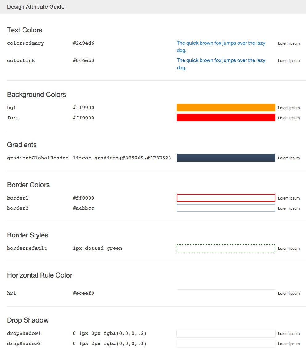
Tokens are grouped by category then categories are conditionally rendered under a human-friendly display name. Tokens with category values not in this list will still be converted and included in the generated output for all other formats.
| Category | Friendly Name |
|---|---|
spacing |
Spacing |
sizing |
Sizing |
font |
Fonts |
font-style |
Font Styles |
font-weight |
Font Weights |
font-size |
Font Sizes |
line-height |
Line Heights |
font-family |
Font Families |
border-style |
Border Styles |
border-color |
Border Colors |
radius |
Radius |
border-radius |
Border Radii |
hr-color |
Horizontal Rule Colors |
background-color |
Background Colors |
gradient |
Gradients |
background-gradient |
Background Gradients |
drop-shadow |
Drop Shadows |
box-shadow |
Box Shadows |
inner-shadow |
Inner Drop Shadows |
text-color |
Text Colors |
text-shadow |
Text Shadows |
time |
Time |
media-query |
Media Queries |
json
raw.json
{ props: { PROP_NAME: { value: "PROP_VALUE", type: "PROP_TYPE", category: "PROP_CATEGORY" } }}ios.json
{ properties: [ { name: "propName", value: "PROP_VALUE", type: "PROP_TYPE", category: "PROP_CATEGORY" } ]}android.xml
PROP_VALUE PROP_VALUE PROP_VALUE PROP_VALUE PROP_VALUEaura.tokens
Custom Format (Handlebars)
const theo = ; theo;A plethora of handlebars helpers,
such as camelcase and stem, are available and will assist in formatting strings in templates.
Custom Format (function)
You may also register a format using a function:
const camelCase = ;const path = ;const theo = ; theo;API
type ConvertOptions = transform: TransformOptions format: FormatOptions /* This option configures theo to resolve aliases. It is set (true) by default and currently CANNOT be disabled. */ resolveAliases?: boolean // This option configures theo to resolve aliases in metadata. This is off (false) by default. resolveMetaAliases?: boolean type TransformOptions = // If no "type" is specified, values will not be transformed type?: string // Path to a token file // or just a filename if using the "data" option file: string // Pass in a data string instead of reading from a file data?: string type FormatOptions = type: string // Available to the format function/template options?: object type Prop = ImmutableMaptype Result = ImmutableMap theo: Promise<string> theo: string theo: void theo: void theo: voidCLI
Please refer to the documentation of the CLI
Design Tokens
Theo consumes Design Token files which are a central location to store design related information such as colors, fonts, widths, animations, etc. These raw values can then be transformed and formatted to meet the needs of any platform.
Let's say you have a web, native iOS, and native Android application that would like to share information such as background colors.
The web might like to consume the colors as hsla values formatted as Sass variables in an .scss file.
iOS might like rgba values formatted as .json.
Finally, Android might like 8 Digit Hex (AARRGGBB) values formatted as .xml.
Instead of hard coding this information in each platform/format, Theo can consume the centralized Design Tokens and output files for each platform.
Spec
A Design Token file is written in either JSON (JSON5 supported) or YAML and should conform to the following spec:
{ // Required // A map of property names and value objects props: { color_brand: { // Required // Can be any valid JSON value value: "#ff0000", // Required // Describe the type of value // [color|number|...] type: "color", // Required // Describe the category of this property // Often used for style guide generation category: "background", // Optional // This value will be included during transform // but excluded during formatting meta: { // This value might be needed for some special transform foo: "bar" } } }, // Optional // Alternatively, you can define props as an array // Useful for maintaining source order in output tokens props: [ { // Required name: "color_brand" // All other properties same as above } ], // Optional // This object will be merged into each property // Values defined on a property level will take precedence global: { category: "some-category", meta: { foo: "baz" } }, // Optional // Share values across multiple props // Aliases are resolved like: {!sky} aliases: { sky: "blue", grass: { value: "green", yourMetadata: "How grass looks" } }, // Optional // Array of design token files to be imported // "aliases" will be imported as well // "aliases" will already be resolved // "global" will already be merged into each prop // Imports resolve according to the Node.js module resolution algorithm: // https://nodejs.org/api/modules.html#modules_all_together imports: [ // Absolute file path "/home/me/file.json", // Relative file path: resolves from the directory of the file where the import occurs "./some/dir/file.json", // Module path "some-node-module" ]}