Atomic10 Components
Atomic10 is a React component library with clean, contemporary, and customizable components. New components will be created and added with future updates.


Install
Atomic10 components are simple to install and use.
npm i atomic10-componentsUsage
Interactive Component Storybook Environment:
https://atomic10-storybook.jamesonb.com
Components:
Primary Button
Secondary Button
Primary Button
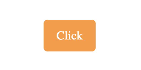
This primary button is a solid color button with rounded corners. There is a shrink hover effect on this button. Customize the color, text, and onClick function.
import { PrimaryButton } from "atomic10-components";

handleClick  =  ()  =>  {
    alert("Click");
};

<PrimaryButton  value="Click"  onClick={handleClick}  />
Properties
| Name | Type | Default | Description |
|---|---|---|---|
bkcolor |
string | Neon Carrot |
Background color. Accepts hex, rgb, and string |
onClick |
function | null |
Callback for buttons onClick |
ftcolor |
string | White |
Font color. Accepts hex, rgb, and string |
value |
string | null |
Text of the button |
Styling
List of class names for styling.
| Name | Element |
|---|---|
a10-primary-button |
div |
Secondary Button
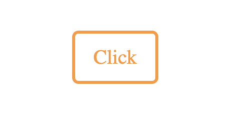
This secondary button is a solid white button with colored border and text. This button has rounded corners. There is a shrink hover effect on this button. Customize the color, text, and onClick function.
import { SecondaryButton } from "atomic10-components";

handleClick  =  ()  =>  {
    alert("Click");
};

<SecondaryButton  value="Click"  onClick={handleClick}  />
Properties
| Name | Type | Default | Description |
|---|---|---|---|
onClick |
function | null |
Callback for buttons onClick |
color |
string | Neon Carrot |
Border and font color. Accepts hex, rgb, and string |
value |
string | null |
Text of the button |
Styling
List of class names for styling.
| Name | Element |
|---|---|
a10-secondary-button |
div |
Text Input
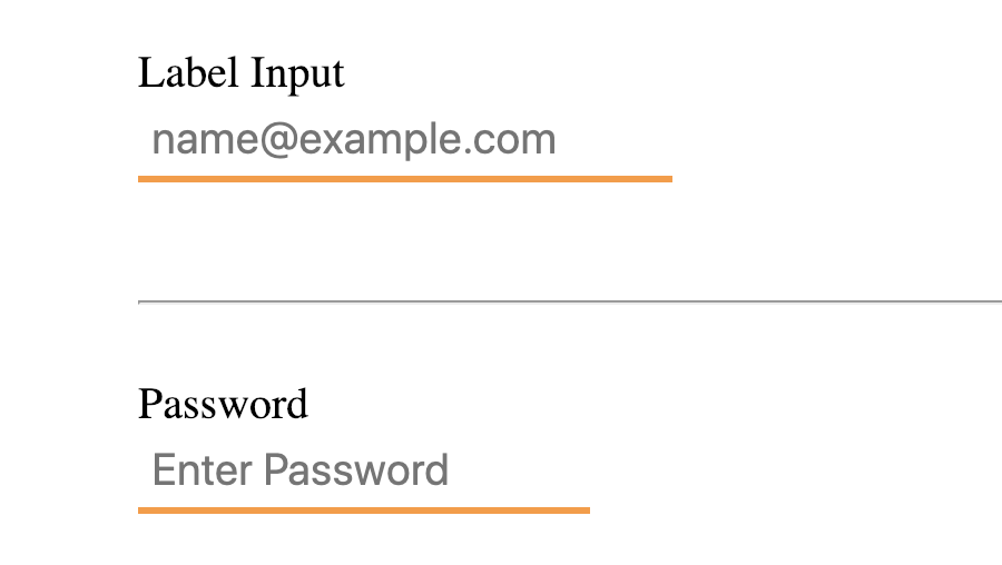
This is a customizable input component. Just like a regular input the type, value, placeholder and more can be specified as properties along with color customization, width, and more features.
import { TextInput } from "atomic10-components";

<TextInput label="Label Input" placeholder="name@example.com" width="30%" />
<hr />
<TextInput label="Password" placeholder="Enter Password" type="password" />
Properties
| Name | Type | Default | Description |
|---|---|---|---|
type |
string | text |
Input type attribute |
label |
string | null |
Label above input |
value |
string | null |
Input value attribute |
placeholder |
string | null |
Input placeholder value |
onChange |
function | null |
Callback for onChange |
name |
string | null |
Name attribute of input |
ftColor |
string | black |
Input font color. Accepts hex, rgb, and string |
bkColor |
string | Neon Orange |
Input bottom border color. Accepts hex, rgb, and string |
width |
string | null |
Input width. Accepts px, %, and rem/em |
Styling
List of class names for styling.
| Name | Element |
|---|---|
a10-simple-form-group |
div |
a10-simple-text-label |
label |
a10-simple-text-input |
input |
Dropdown
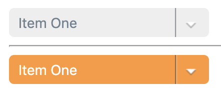
This is a customizable dropdown component. Just like a dropdown the value, onChange, and more can be specified as properties along with color customization and width. The content property is an array of objects to supply the dropdown choices(see example).
import { Dropdown } from "atomic10-components";

<Dropdown
  name='tester'
  value={this.state.value}
  onChange={e => alert(`Changed to ${e.target.value}`)}
  content={content}
/>
<hr />
<Dropdown
  name='tester'
  value={this.state.value}
  onChange={e => alert(`Changed to ${e.target.value}`)}
  content={content}
  ftColor='white'
  bkColor='#FF9933'
/>
Properties
| Name | Type | Default | Description |
|---|---|---|---|
name |
string | null |
Name attribute for select element's value |
value |
string | null |
Dropdown value attribute |
onChange |
function | null |
Callback for onChange |
ftColor |
string | slategray |
Dropdown font color. Accepts hex, rgb, and string |
bkColor |
string | #eee |
Dropdown bottom border color. Accepts hex, rgb, and string |
width |
string | null |
Dropdown width. Accepts px, %, and rem/em |
content |
array | null |
Content is array of choices formatted as objects |
Content-Example:
textandvaluefields are require.keyfield is optional.const content = [ { text: 'Item One', value: 'one', key: 1 }, { text: 'Item Two', value: 'two', key: 2 }, { text: 'Item Three', value: 'three', key: 3 } ];
Styling
List of class names for styling.
| Name | Element |
|---|---|
a10-dropdown |
div |
Toggle Switch
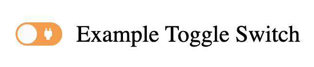
This is a customizable toggle switch. The toggle can be customized with a label, checked/unchecked icons, defaultChecked state, and an onChange function.
To change the primary color from orange:
// CSS
.react-toggle {
  background: blue
}
import { ToggleSwitch } from "atomic10-components";

<ToggleSwitch
  checkIcon='power_off'
  uncheckIcon='power'
  defaultChecked={'default checked state'}
  onChange={'onChange Callback'}
  label='Example Toggle Switch'
/>
Properties
| Name | Type | Default | Description |
|---|---|---|---|
checkIcon |
string | null |
Icon name from Material Design |
uncheckIcon |
string | null |
Icon name from Material Design |
defaultChecked |
state/prop | null |
State/prop for defaultChecked value |
onChange |
function | null |
Callback for onChange |
label |
string | null |
Label for toggle |
Styling
List of class names for styling.
| Name | Element |
|---|---|
a10-toggle-switch-label |
label |
react-toggle-track |
div(Switch) |
react-toggle-thumb |
div(Slider) |
material-icons |
i(Icon) |
Simple Card
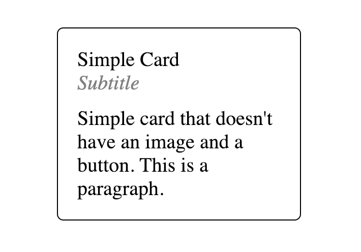
This is a simple card that can store data for a product, service, etc. Card can have an onClick added. All content is customizable and the box will auto format as info grows.
import { SimpleCard } from "atomic10-components";

<SimpleCard
  title="Simple Card"
  subTitle="Subtitle"
  paragraph="Simple card that doesn't have an image and a button. This is a paragraph."
  onClick={() => alert("Card Click")}
/>
Properties
| Name | Type | Default | Description |
|---|---|---|---|
bkColor |
string | White |
Card background color. Accepts hex, rgb, and string |
brdColor |
string | Black |
Border color. Accepts hex, rgb, and string |
onClick |
function | null |
Callback for card onClick |
paragraph |
string | null |
Paragraph for card |
title |
string | null |
Text of the card |
subTitle |
string | null |
Subtitle for card |
width |
string | 30% |
Width for card |
Styling
List of class names for styling.
| Name | Element |
|---|---|
a10-secondary-button |
div |
a10-title |
div |
a10-subtitle |
div |
a10-paragraph |
div |
Advanced Card
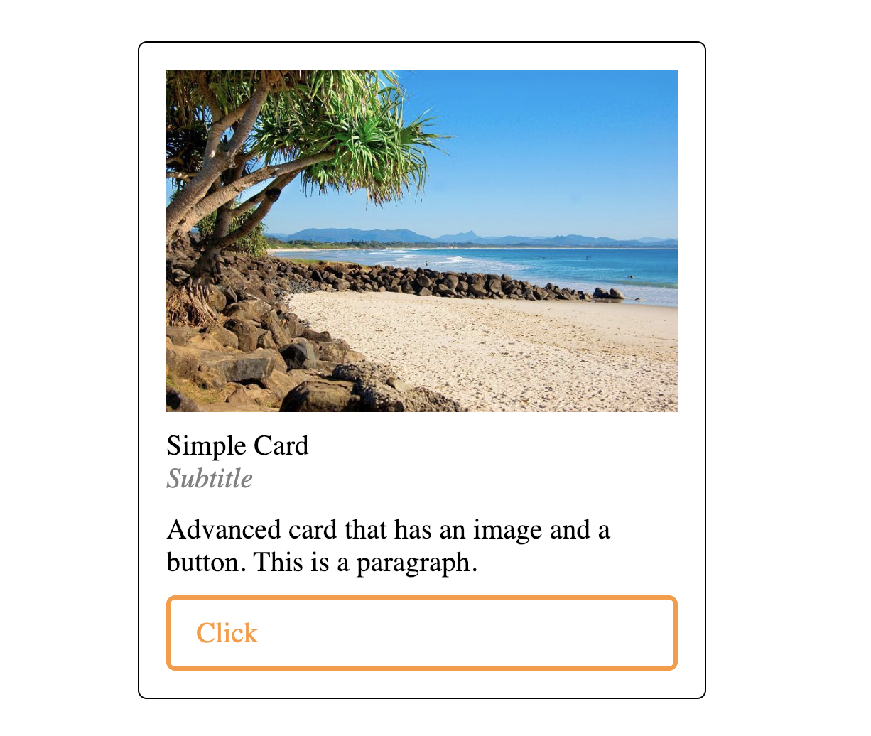
This is an advanced card that can store data for a product, service, profile, etc. Card and button have separate customizable onClick. Image, content, and button are customizable and the box will auto format as info grows.
import { AdvancedCard } from "atomic10-components";

<AdvancedCard
  title="Simple Card"
  subTitle="Subtitle"
  paragraph="Advanced card that has an image and a button. This is a paragraph."
  onClick={() => alert("Card Click")}
  btnClick={() => alert("Button Click")}
  btnValue="Click"
  image="https://goo.gl/2QuCc5"
  width="50%"
/>
Properties
| Name | Type | Default | Description |
|---|---|---|---|
bkColor |
string | White |
Card background color. Accepts hex, rgb, and string |
brdColor |
string | Black |
Border color. Accepts hex, rgb, and string |
btnClick |
function | null |
Callback for button onClick |
btnColor |
string | Neon Carrot |
Button color. Accepts hex, rgb, and string |
btnValue |
string | Black |
Text of the button |
onClick |
function | null |
Callback for card onClick |
image |
image | null |
Image for header |
paragraph |
string | null |
Paragraph for card |
title |
string | null |
Text of the card |
subTitle |
string | null |
Subtitle for card |
width |
string | 30% |
Width for card. Accepts px, %, and rem/em |
Styling
List of class names for styling.
| Name | Element |
|---|---|
a10-advanced-button |
div |
a10-img |
img |
a10-title |
div |
a10-subtitle |
div |
a10-paragraph |
div |
Black and White To Do Form
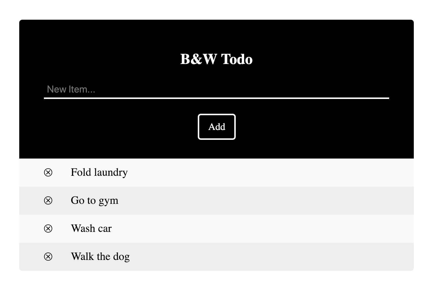
This is a black and white todo form. Items can be added to the list directly on the component, can be deleted from list, and can be completed(crossed out). The list is persistent through localStorage. You can create a function that clears this storage by removing the key of: "${title} list" from localStorage.
import { BWTodo } from "atomic10-components";

const todoList = ["Fold laundry", "Go to gym", "Wash car", "Walk the dog"];

<BWTodo list={todoList} title="B&W Todo" />
Properties
| Name | Type | Default | Description |
|---|---|---|---|
title |
string | null |
Title of the to do form in header |
list |
array | null |
An array of to do items to prepopulate list |
Styling
List of class names for styling.
| Name | Element |
|---|---|
a10-header |
div |
a10-title |
h2 |
myUL(id not class) |
ul |
Colored To Do Form
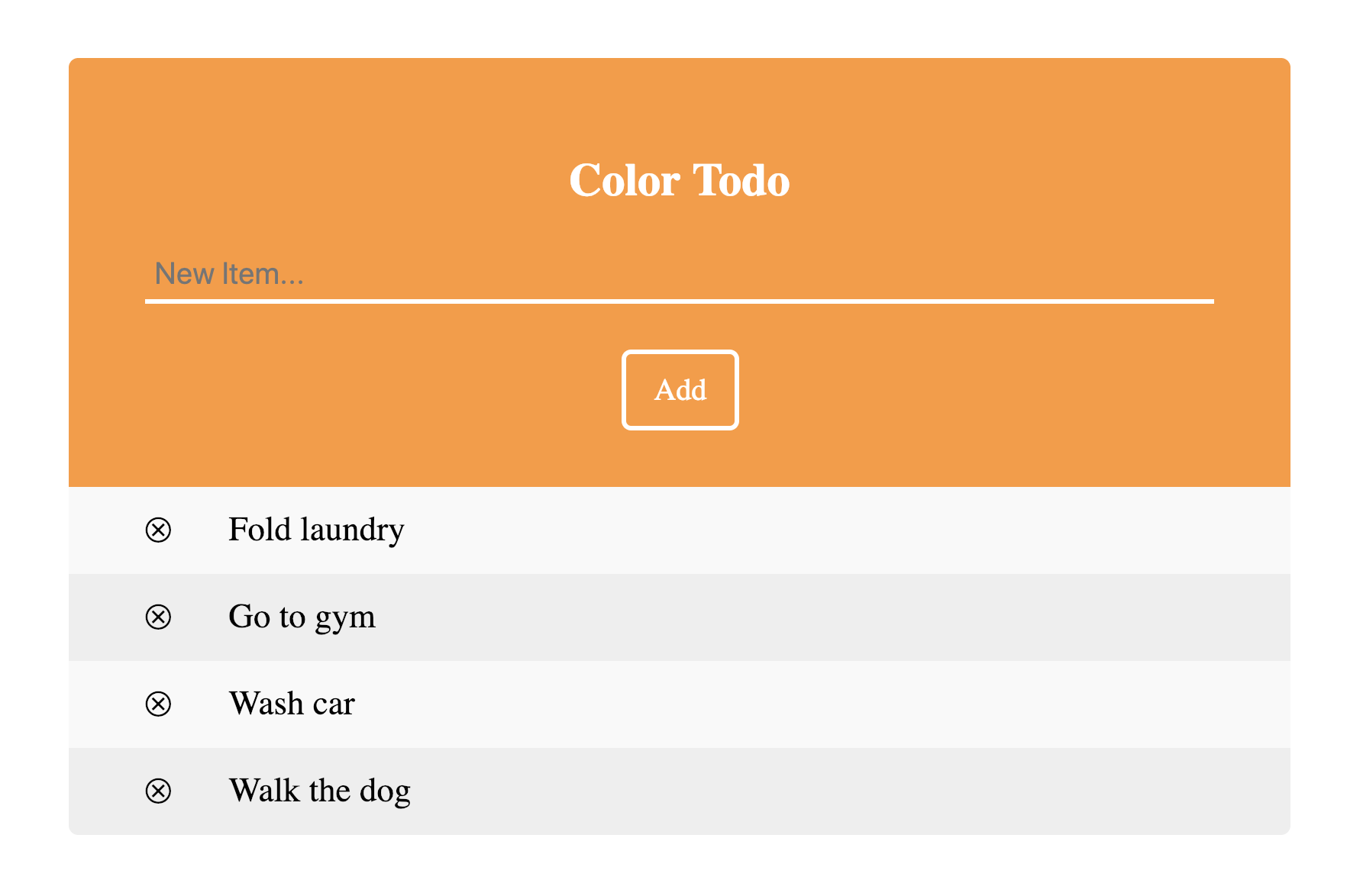
This is a customizable colored todo form. Items can be added to the list directly on the component, can be deleted from list, and can be completed(crossed out). The list is persistent through localStorage. You can create a function that clears this storage by removing the key of: "${title} list" from localStorage. Colors, title, placeholder, and more can be customized.
import { CTodo } from "atomic10-components";

const todoList = ["Fold laundry", "Go to gym", "Wash car", "Walk the dog"];

<CTodo list={todoList} title="Color Todo" placeholder="New Item..." />
Properties
| Name | Type | Default | Description |
|---|---|---|---|
title |
string | null |
Title of the to do form in header |
list |
array | null |
An array of to do items to prepopulate list |
placeholder |
string | null |
Placeholder for form input |
bkColor |
string | Neon Carrot |
Header background color. Accepts hex, rgb, and string |
ftColor |
string | White |
Input font color. Accepts hex, rgb, and string |
inColor |
string | White |
Input line color. Accepts hex, rgb, and string |
btnColor |
string | White |
Button and title color. Accepts hex, rgb, and string |
Styling
List of class names for styling.
| Name | Element |
|---|---|
a10-color-todo |
div |
a10-header |
div |
myUL(id not class) |
ul |
License
Issues and Issue Tracker
Please see the open issues in our issue tracker. If you have questions, concerns, bug reports, etc, please file an issue. Our Issue Tracker
Before reporting a bug or issue please make sure it is not already reported. If it isn't, report using the following format.
Example:
Short and descriptive example bug report title
A summary of the issue and the browser/OS environment in which it occurs. If suitable, include the steps required to reproduce the bug.
- This is the first step
- This is the second step
- Further steps, etc.
Any other information you want to share that is relevant to the issue being reported. This might include the lines of code that you have identified as causing the bug, and potential solutions (and your opinions on their merits).
A good bug/issue report shouldn't leave others needing to chase you up for more information. Please try to be as detailed as possible in your report. What is your environment? What steps will reproduce the issue? What browser(s) and OS experience the problem? What would you expect to be the outcome? All these details will help people to fix any potential bugs.