vui-field


This component contains SASS mixins and CSS which can be used to style fields and labels. It's best used in conjunction with the VUI inputs and VUI grid system components.
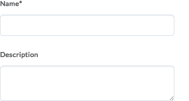
Here's what fields look like:
For further information on this and other VUI components, see the docs at ui.valence.d2l.com.
Installation
vui-field can be installed from Bower:
bower install vui-fieldOr alternatively from NPM:
npm install vui-fieldDepending on which installation method you choose, use that path when doing the SASS import:
;// or... ;Usage
Field Rows
In order to create some vertical space between fields, use the vui-field-row() mixin on a parent element, like a <div>.
HTML:
<!-- field 1 --> <!-- field 2 --><!-- and so on... -->SCSS:
.field-row Field Labels
Within each field row, your form input element (text, checkbox, select, etc.) should always be associated with a text label using the HTML <label> element. For accessibility, don't forget to connect the label with the input using the for and id attributes.
HTML:
First Name Use the vui-field-label() mixin to apply typographical styles to the label:
.field-label Stacked vs. Inline Labels
By default, the vui-field-label() mixin assumes you would like the label to be stacked vertically above the input, and as such provides some space between the two.
If instead you'd like the label to be positioned beside the input, pass true as the value of the inline parameter:
.field-label-inline Sample of inline labels:

NOTE: For inline labels, to position the label beside the input, we recommend using a grid system such as the VUI Grid System.
Required Fields
To visually call out a field as required, the vui-field-label-required() mixin can be applied to the label. It should be applied in addition to the vui-field-label() mixin.
A required field:

Important: this is merely a visual flag. To ensure you meet accessibility requirements, mark up the corresponding input with the HTML required and aria-required attributes.
HTML:
First NameSASS:
.field-label-required Fieldsets
When you have more than one related form element (like checkboxes and radio buttons), group them together using the <fieldset> and <legend> elements. WCAG: techniques for using fieldset and legend.
For example:

The field row and label mixins can then be applied to the <fieldset> and <legend> elements:
What would you like for lunch? hamburger hot dogCoding styles
See the VUI Best Practices & Style Guide for information on VUI naming conventions, plus information about the EditorConfig rules used in this repo.