
ToastJS-React
ToastJS-React provides you create toasts for your responses.
Installation
Follow the instructions to install ToastJS-React
$ npm install toastjs-react
Usage
Add ToastJS-React CSS file to your index.js.
import 'toastjs-react/index.css'You must add your app components or elements between
<ToastContainer>
component.
import { ToastContainer } from 'toastjs-react'

return (
  <ToastContainer maxMessageCount={5} position="center">
    <App />
  </ToastContainer>
);
You can limit your max toasts in your projects using below.
Change Your Maximum Toast
maxMessageCount={5} // Optional, default = 10Change Your Toast Positin
position={"left"|"right"|"center"} // Optional, default = "right"You could have many toasts in your screen. ToastJS-React is going to add them to a queue. It will show them in order. For example: You have 8 toasts. And you set your max toast = 5 then firstly you are going to see 5 toasts until they become to fade out. Next, you are going to see other 3 toasts.
Show Your Toast
// Import useGlobalMessage Hook
import { useGlobalMessage } from 'toastjs-react';
// Call It In Your Component
const toast = useGlobalMessage();
// And Show It!
toast.show({
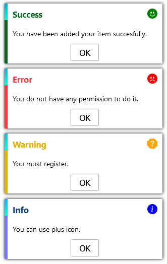
type: "success",
message: "You have been added your item succesfully.",
autoCloseWithTimeout: true,
timeout: 2000,
});
Properties
    {
        // Message Which Will Be Shown
        message:string,

        // Type
        type:"info"|"error"|"success"|"warning",

        /*
        * You can add a timeout for your toast. After this time it will be fade out.
        * Optional, default = 1000ms
        */
        timeout:number,

        /*
        * If you want to close your toast after timeout. You must set it as "true".
        * Optional, default = false
        */
        autoCloseWithTimeout:boolean,

        /*
        * There is an animation in your toast but you can deactive it below.
        * Optional
        */
        animation:{
            /*
            * If you do not want to any animation. Set it as "false".
            * Optional, default = true
            */
            slideAnimation:boolean

            /*
            * You can also add a duration for your animation.
            * Optional, default = 1000
            */
            animationDuration:number
        },

        /*
        * This is your header. You can add an element. It would change depends your type.
        * If you want to custom header change it.
        * Optional, default = null
        */
        header:React.ReactElement,

        /*
        * This is your body. You can add an element.
        * If you want to custom body change it.
        * Optional, default = null
        */
        body:React.ReactElement,

        /*
        * You can change your toast class name with this properties.
        * Optional, default = ".message_wrapper"
        */
        className:string,

        /*
        * This is title of toast. Depends your type.
        * If you want to custom title change it.
        * Optional, default = ""
        */
        title:string,

        /*
        * This is button of toast.
        * Optional
        */
        button:{
            /*
            * Change class name for your custom style.
            * Optional, default = ""
            */
            className?:string,

            /*
            * Change title for your custom button title.
            * Optional, default = "OK"
            */
            title?:string
        },

        /*
        * You do not have to use our toast component. You can create a custom and define it.
        * Optional, default = null
        */
        Component?: React.FC,

        /*
        * You can use to fetch with promise
        * Also, you can take error or success response and no matter what 'hasError' is
        * successComponent is for when the result is successfull otherwise errorComponent but if promise is in fetching, Component will be shown by default
        */
        fetchingOptions?:{
           promise: Promise<any>
           errorComponent: (response?:any)=>React.ReactElement
           successComponent: (response?:any)=>React.ReactElement
           response: (response: object, hasError: boolean) => void
        }

    }
Built With
License
Distributed under the MIT License.
- Customing any message has been improved
- The importing of index.css position has been corrected
- Fixed background color for message box
- Added 'response' to error and success components for fetching processes