sm-pagination
Basic pagination for mithril and semantic, it can also be used with bootstrap (3+)
It requires mithril and semantic-ui-menu
Pagination file can be used with any common.js it is expect for mithril to be in global (m variable) or it will attempt to load it with require('mithril'), webpack its recommended
Demo
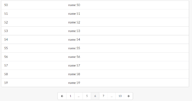
function list(data) { return m('.ui.segment.sixteen.wide.column', [ m('ul.ui.bulleted.list', data.map(function (item) { return m('li', { key: item.id }, item.name); })) ]);} function table(data) { return m('.ui.sixteen.wide.column', [ m('table.ui.table', [ m('tbody', data.map(function (item) { return m('tr', { key: item.id }, [ m('td', item.id), m('td', item.name) ]); })) ]) ]);} module.controller = function () { module.vm.init(); this.pagination = m.component(Pagination, { data: module.vm.data, rowsperpage: module.vm.rowsperpage, pagerender: list, wrapperclass: 'column' }); this.paginationCtrl = new this.pagination.controller();}; module.vm = {};module.vm.init = function () { this.data = array; this.rowsperpage = 10; this.page = m.prop(3);}; module.view = function (ctrl) { return m('.ui.grid.page.one.column', [ m('h1', 'Pagination'), m.component(Pagination, { data: module.vm.data, rowsperpage: module.vm.rowsperpage, pagerender: list, wrapperclass: 'column', page: module.vm.page }), m.component(Pagination, { data: module.vm.data, rowsperpage: module.vm.rowsperpage, pagerender: table, wrapperclass: 'column' }), m('.row', [ m('.column', [ m('br') ]) ]), ctrl.pagination.view(ctrl.paginationCtrl), m('.row', [ m('.column', [ m('button.ui.button', { onclick: function () { module.vm.data.splice(30, 10); ctrl.paginationCtrl.goToPage(4); module.vm.page(4); } }, 'go to page 3') ]) ]) ]);}; m.mount(window.document.body, module); Attributes
It accepts the following properties
- data, array of data to paginate
- rowsperpage, # of rows to show each page
- pagerender, page render function
- wrapperclass, class to add to parent div
- page, m.prop value of the current page
- class object map with:
- activeClass, applied to the active icons, defaults
active - itemClass, applied to non icon items, defaults
icon - leftIconClass, applied to the left arrow icon item, defaults
left arrow icon - rightIconClass, applied to the right arrow icon item, defaults
right arrow icon - iconItemClass, applied to the icon item items, defaults
icon item, - disabledClass, applied to disaled items, defaults
disabled - menuClass, applied to the menu pagination parent div, defaults
ui pagination menu small
- activeClass, applied to the active icons, defaults
Bootstrap
To make it look good with bootstrap just pass the followin classes, tested with bootstrap 3+
classes: {
    leftIconClass: 'glyphicon glyphicon-arrow-left',
    rightIconClass: 'glyphicon glyphicon-arrow-right'
}