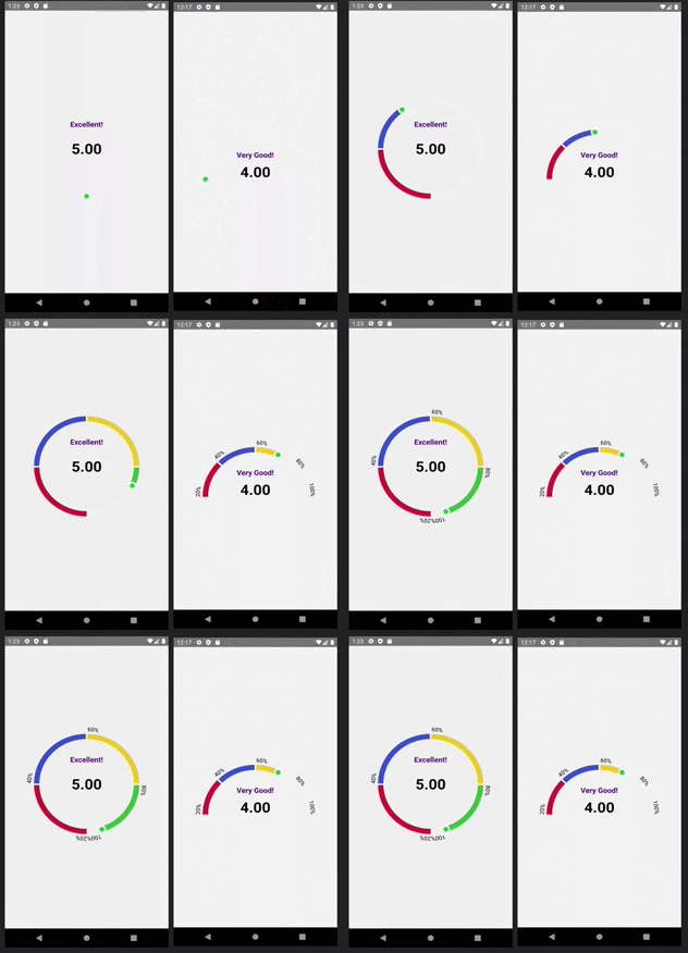
React Native Segment ProgressBar
Segment ProgressBar for React Native, works on both iOS and Android. Check out our documentation below to learn how to get started.
Demo and Docs
Idea & base code adapted from https://github.com/shipt/segmented-arc-for-react-native
Example Image
Contents
🚀 Installation
-
Install
react-native-segment-progress-bar -
Install
react-native-svglibrary for Dependency
yarn add react-native-segment-progress-barnpm install react-native-segment-progress-bar🎉 Usage
Here is a basic example of how to use this component. It covers all the main features.
import React, { useState } from 'react';
import { View, Text, Pressable } from 'react-native';
import { ArcProgressBar } from 'react-native-segment-progress-bar';

const App = () => {
  const [showArcRanges, setShowArcRanges] = useState(false);

  const segments = [
    {
      scale: 0.25,
      filledColor: '#C70039',
      emptyColor: '#F2F3F5',
      data: { label: 'Not bad!' }
    },
    {
      scale: 0.25,
      filledColor: '#404FCD',
      emptyColor: '#F2F3F5',
      data: { label: 'Good!' }
    },
    {
      scale: 0.25,
      filledColor: '#EBD22F',
      emptyColor: '#F2F3F5',
      data: { label: 'Very Good!' }
    },
    {
      scale: 0.25,
      filledColor: '#44CD40',
      emptyColor: '#F2F3F5',
      data: { label: 'Excellent!' }
    }
  ];

  const ranges = ['10%', '20%', '30%', '40%', '50%'];

  const _handlePress = () => {
    setShowArcRanges(!showArcRanges);
  };

  return (
    <View style={{ flex: 1, alignItems: 'center', justifyContent: 'center' }}>
      <ArcProgressBar
        segments={segments}
        fillValue={70}
        isAnimated={true}
        animationDelay={1000}
        showArcRanges={showArcRanges}
        ranges={ranges}
      >
        {data => (
          <Pressable onPress={_handlePress} style={{ alignItems: 'center' }}>
            <Text style={{ fontSize: 16, paddingTop: 16 }}>{data.lastFilledSegment.data.label}</Text>
            <Text style={{ lineHeight: 80, fontSize: 24 }}>More info</Text>
          </Pressable>
        )}
      </ArcProgressBar>
    </View>
  );
};

export default App;
📖 Props
| Name | Type | Default | Description |
|---|---|---|---|
| fillValue | number (0-100) | 0 | Current progress value |
| segments | Array of { scale: number, filledColor: string, emptyColor: string, data: object } | [] | Segments of the arc. Here, scale is a percentage value out of 100%, filledColor for filled part of a segment, and emptyColor is background color for an empty segment, data could be any object that you'd want to receive back for a segment. See example above. |
| filledArcWidth | number | 8 | Thickness of progress line |
| emptyArcWidth | number | 8 | Thickness of background line |
| spaceBetweenSegments | number | 2 | Space between segments |
| arcDegree | number | 180 | Degree of arc |
| radius | number | 100 | Arc radius |
| isAnimated | bool | true | Enable/disable progress animation |
| animationDuration | number | 1000 | Progress animation duration |
| animationDelay | number | 0 | Progress animation delay |
| ranges | Array of strings | [] | Arc ranges (segments) display values |
| rangesTextColor | string | '#000000' | Color of ranges text |
| rangesTextStyle | object | { fontSize: 12 } | Ranges text styling |
| showArcRanges | bool | false | Show/hide arc ranges |
| middleContentContainerStyle | object | {} | Extra styling for the middle content container |
| capInnerColor | string | '#28E037' | Cap's inner color |
| capOuterColor | string | '#FFFFFF' | Cap's outer color |
| children | function | Pass a function as a child. It receives metaData with the last filled segment's data as an argument. From there you can extract data object. See example above. | |
📄 License
MIT
