react-modal-zinkat
A customizable and reusable React modal component
Install
npm install --save react-modal-zinkatUsage
import React, { useState } from 'react'
import Modal from 'react-modal-zinkat'
import 'react-modal-zinkat/dist/index.css'

const App = () => {
  const [isModalOpen, setModalOpen] = React.useState(false);

  const openModal = () => setModalOpen(true);
  const closeModal = () => setModalOpen(false);

    const handleEvent = () => {
    // This function is called during an event
    // It opens the modal to indicate information
    openModal();
  };

  return (
    <div>
      <button onClick={handleEvent}>Open</button>
      <Modal isOpen={isModalOpen} onClose={closeModal} contentBtn="Close">
        {/* Modal content goes here */}
        Hello, this is my modal!
      </Modal>
    </div>
  );
};

export default App;
Props
-
isOpen(boolean): Controls whether the modal is open or closed. -
onClose(function): Callback function triggered when the modal is requested to be closed. -
children(node): Content of the modal. -
contentBtn(node): Button for closing the modal .
Tests
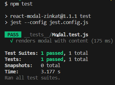
This component is accompanied by an automated test suite to ensure its proper functionality. You can review and run these tests by following the instructions below.
Running the Tests
- Clone the repository to your local machine.
- Install dependencies using the command
npm install. - Run the command
npm testto execute the test suite.
Configuration unit test
You can obtain the necessary configuration files directly from the GitHub repository:
License
MIT © Zineb


