node-red-dashboard
This module provides a set of nodes in Node-RED to quickly create a live data dashboard.
For the latest updates see the CHANGELOG.md
Pre-requisites
Node-RED-Dashboard requires Node-RED version 0.14 or more recent.
Install
To install the stable version run the following command in your Node-RED user directory (typically ~/.node-red):
npm i node-red-dashboard
Open your Node-RED instance and you should have UI nodes available in the palette and a new dashboard tab in the
right side panel. The UI interface is available at http://localhost:1880/ui (if the default settings are used).
If you want to try the latest version from github, you can install it by
npm i node-red/node-red-dashboard
Features
Dashboard sidebar
The widget layout is managed by a dashboard tab in the sidebar of the Node-RED editor.
Layout
-
Tabs - From here you can re-order the tabs, groups and widgets, and add and edit their properties.
-
Links - to other web pages can also be added to the menu. They can optionally be opened in an iframe - if allowed by the target page.
Theme
- Style - the theme and font of the UI is set in the dashboard sidebar. You can select a default Light, Dark or Custom Theme. You cannot have different themes for each tab.
Site
-
Title - the
titleof the UI page can be set. -
Options - optionally hide the title bar, and allow swiping sideways between tabs on a touch screen.
-
Sizes - sets the basic geometry of the grid layout in pixels. The width and height of widgets can be set, as can the width of groups. These are all specified in units of approximately 50 pixels.
Widgets
The default width of a group is 6 units ( ≈300 pixels ). Setting a widget to auto will fill the available
width of the group. It is still advisable to use multiple groups if possible, rather than one big group, so that the page can dynamically resize on smaller screens.
Group labels are optional.
Most widgets can have a label and value - both of these can be specified by properties of the incoming msg if required, and modified by angular filters. For example the label can be set to {{msg.topic}}, or the value could be set to {{value | number:1}}% to round the value to one decimal place and append a % sign.
Note: Each node may parse the msg.payload to make it suitable for display. This converted version is exposed as the variable called value, (see example above).
Any widget can be disabled by passing in a msg.enabled property set to false;. Note: this doesn't stop the widget receiving messages but does stop inputs being active and does re-style the widget.
-
Audio out - a widget that will let you play audio (wav or mp3) or send Text to Speech (TTS) to the client.
-
Button - the icon can be set using either Material or fa-icons - the colour and background colour may also be set. If the widget is sized to 1 wide the icon has precedence.
-
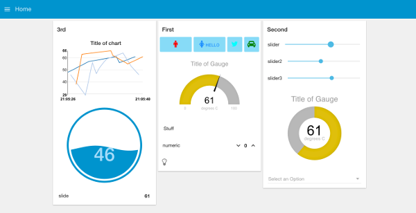
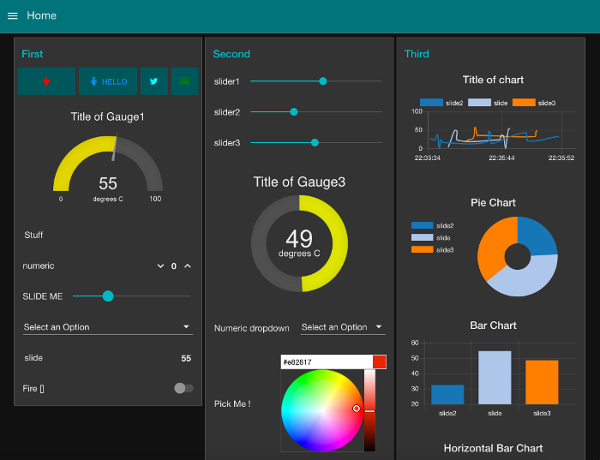
Chart - has both line, bar and pie chart modes. Also the X-Axis labels can be customised using a date formatter string. See this document for more information on the chart data formats accepted.
-
Colour Picker - a colour picker widget.
-
Date Picker - a date picker widget. The displayed Date format can be specified in the Site tab using moment.js formatting.
-
Dropdown - a dropdown select widget has been added. Multiple label, value pairs can be specified. The choices can also be set via
msg.optionscontaining an array of objects. If just text then the value will be the same as the label, otherwise you can specify both by using an object of "label":"value" pairs :[ "Choice 1", "Choice 2", {"Choice 3": 3} ]Setting
msg.payloadwill pre-select the value in the dropdown. -
Form - a widget that can be composed of several sub-widgets. When submitted all values are submitted as a single message.
-
Gauge - has 4 modes - standard (simple gauge), donut (complete 360°), compass, and wave. You can also specify the colour range of the standard and donut gauges.
-
Notification - creates alerts to the user - can either be a toast popup, or a dismissable alert box. The alert may be targeted to a single user.
-
Numeric - a Numeric input widget with up/down buttons.
-
Slider - a simple horizontal slider, with variable step size.
-
Switch - can also set two icons and/or colours depending on state.
-
Template - the template node allows the user to specify and create their own widgets within the framework using HTML, Javascript. This is an Angular.js widget. You may also use this to override the built in CSS styles.
-
Text - A read only widget, the layout of the
label, andvaluecan be configured. -
Text input - text input box, with optional label, can also support password, email and colour modes.
-
UI-Control - allows some dynamic control of the dashboard. Sending a
msg.payloadof the tab number (from 0) or name will switch to that tab. Outputs amsg.payloadfor every browser connection and loss, that can be used to trigger other actions.
Tip: The Text widget will accept html - so you can use it together with the fa-icons we already use to create indicator type widgets.
Securing the Dashboard
You can use the httpNodeAuth property in your Node-RED settings.js file to secure the Dashboard as it is
created the same way as other HTTP nodes are. The details can be found at the bottom of this page in the
docs http://nodered.org/docs/security
Multiple Users
This Dashboard does NOT support multiple individual users. It is a view of the status of the underlying Node-RED flow, which itself is single user. If the state of the flow changes then all clients will get notified of that change.
Discussions and suggestions
Use the Node-RED google group: https://groups.google.com/forum/#!forum/node-red or the Dashboard-ui channel in Slack
The current work in progress list is shown in the Github Project.
Contributing
Before raising a pull-request, please read our contributing guide.
This project adheres to the Contributor Covenant 1.4. By participating, you are expected to uphold this code. Please report unacceptable behavior to any of the project's core team.
Developers
cd ~\.node-red\node_modules
git clone https://github.com/node-red/node-red-dashboard.git
cd node-red-dashboard
npm install
The plugin uses the dist folder if it exists. Make sure it has been deleted if you want to use the non-minified version while developing.
After finishing changes to the front-end code in the src folder, you can use gulp to update and rebuild the minified files and update the appcache manifest.
gulp
We also have suggested lint and js styles that can be checked with:
gulp lint
gulp jscs
If submitting a Pull Request (PR) please do NOT include the minified /dist files.
Thank you.