
Simple bottom sheet modal for Angular, using Tailwind CSS.
This library was generated with Angular CLI version 17.3.0.
- Create clear and reusable modal components.
- It creating managing modals painless and clearer.
- Pass data to the modal and implement any content you want
- Open a modal from another. Stack several ones.
- Responsive: displayed as bottom sheet on mobile and as modal dialog in desktop
View the live demo
- Tailwind CSS. Check Angular installation
npm install ngx-bottom-sheet-modal1. Add the bottom sheet modal wrapper to your app root. Import it into your component definition and add it to the end of the template:
import { Component } from '@angular/core';
import { RouterOutlet } from '@angular/router';
import { NgxBottomSheetModalComponent } from 'ngx-bottom-sheet-modal';

@Component({
  selector: 'app-root',
  standalone: true,
  template: `
  <router-outlet></router-outlet>
  <ngx-bottom-sheet-modal></ngx-bottom-sheet-modal>
  `,
  styleUrl: './app.component.scss',
  imports: [RouterOutlet, NgxBottomSheetModalComponent],
})
export class AppComponent {
  }
}import { Component, Input, inject } from "@angular/core";
import { NgxBottomSheetModalService } from "ngx-bottom-sheet-modal";
@Component({
selector: "app-modal-content-component",
standalone: true,
imports: [],
template: `
<div class="pt-4 lg:w-96 overflow-auto max-h-screen md:overflow-hidden bg-white dark:bg-slate-900 dark:text-white">
<div class="px-4">
<h1 class="font-bold text-xl">{{ title }}</h1>
<p>{{ description }}</p>
</div>
<p class="px-4 py-2 mt-4 bg-slate-200 dark:bg-slate-700">ⓘ Tap outside or click button below to close.</p>
<div class="px-4 overflow-auto md:max-h-96">
<p class="pt-4 font-semibold" (click)="expandedContent = !expandedContent">
{{ expandedContent ? "Show less content [-]" : "Show more content [+]" }}
</p>
@if(expandedContent) {
<p class="py-24">Some text</p>
<p class="py-24">Some text</p>
<p class="py-24">Some text</p>
<p class="py-24">Some text</p>
}
</div>
<div class="p-4 flex justify-end sticky bottom-0 bg-white dark:bg-slate-900 border-t-2 w-full md:rounded-b-xl">
<button type="button" (click)="close()" class="bg-cyan-600 text-white text-sm leading-6 font-medium py-2 px-3 rounded-lg">Close</button>
</div>
</div>
`,
styles: ``,
})
export class ModalContentComponent {
// Services
private readonly ngxBottomSheetModalService = inject(NgxBottomSheetModalService);
// Inputs
@Input() title!: string;
@Input() description!: string;
// State
expandedContent: boolean = false;
close() {
this.ngxBottomSheetModalService.closeBottomSheet();
}
}Inject the modal service to the component from which you want to open the modal. Now you can call openBottomSheet method any time you want to open the bottom sheet modal, using the NgxBottomSheetModalConfig object.
| Name | Required | Type | Default | Description |
|---|---|---|---|---|
| contentComponent | true | Type | Content component class | |
| inputs | false | Record<string, unknown> | An object containing the data. Each property of it can be mapped as an input property in the content component | |
| onClose | false | () => void | Callback function to be called when the modal is closed by the user | |
| canClose | false | boolean | true | Allows to close (dismiss) the modal tapping in the back shade |
| showCloseButton | false | boolean | true | Show a close icon button in the top-rigth corner of the bottom sheet modal. Works only if canClose is set to true
|
| closeButtonClass | false | string | text-gray-500 dark:text-gray-300 | Close icon button class |
import { Component, inject } from "@angular/core";
import { NgxBottomSheetModalService } from "ngx-bottom-sheet-modal";
import { ModalContentComponent } from "./modal-content-component.component";
@Component({
selector: "app-component",
standalone: true,
template: `
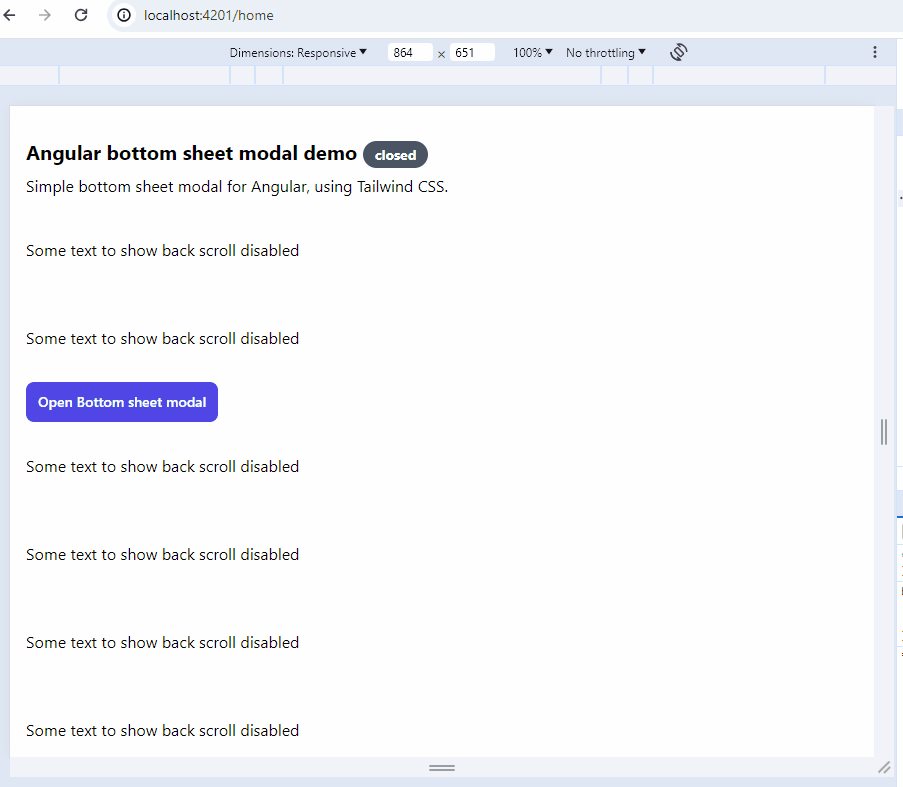
<section class="dark:text-slate-300">
<h1 class="font-bold text-xl mt-4 mb-4">
Angular bottom sheet modal demo
<span class="bg-red-500 text-white rounded-full px-3 py-1 text-sm" [class.!bg-green-500]="opened">{{ opened ? "opened" : "closed" }}</span>
</h1>
<p class="mb-2">Simple bottom sheet modal for Angular, using Tailwind CSS.</p>
<button type="button" (click)="openBottomSheetModal()" class="bg-cyan-600 text-white leading-6 font-medium py-2 px-3 rounded-lg">Open Bottom sheet modal</button>
</section>
`,
styles: ``,
imports: [],
})
export class BottomSheetModalPageComponent {
// Services
private readonly ngxBottomSheetModalService = inject(NgxBottomSheetModalService);
// State
opened: boolean = false;
constructor() {}
openBottomSheetModal() {
this.ngxBottomSheetModalService.openBottomSheet({
contentComponent: ModalContentComponent,
inputs: data,
inputs: {
title: "My modal",
description: "A simple bottom sheet modal :)",
},
onClose: () => {
this.opened = false;
},
closeButtonClass: "text-cyan-400 dark:text-cyan-200",
});
this.opened = true;
}
}As you can see, you can pass any data to the modal component using the inputs parameter of the openBottomSheet method. The data will be available in the modal component as @Input properties.
Add provideAnimations() to your providers in the app.congif.ts file:
import { provideAnimations } from "@angular/platform-browser/animations";

export const appConfig: ApplicationConfig = {
  providers: [...provideAnimations()],
};Include the ngx-bottom-sheet-modal styles. Add the following to the content section in your tailwind.config.js file:
/** @type {import('tailwindcss').Config} */
module.exports = {
  content: ["./src/**/*.{html,ts}", "./node_modules/ngx-bottom-sheet-modal/**/*.{html,ts,js,mjs}"],
  theme: {
    extend: {},
  },
  plugins: [],
};This project is licensed under the MIT License - see the LICENSE file for details.