easy-skeleton-loader-vue
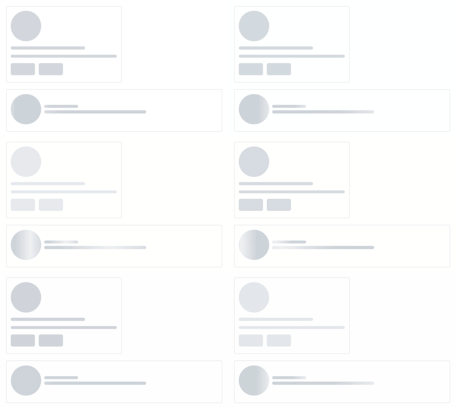
Loader showing skeleton view while data is being loaded to improve UX.
- easy to used
<SkeletonShape type="text" animation="fade-in" />- build your own skeleton
  <SkeletonCard animation="wave" />
  <SkeletonUser animation="fade-in" />
Installation
Install easy-skeleton-loader-vue with :
- npm
npm install easy-skeleton-loader-vue --save
- yarn
yarn add easy-skeleton-loader-vue
Usage/Examples
- import styles.css in your App.vue
import 'easy-skeleton-loader-vue/styles.css';now you can use the skeleton
- Using 'easy-skeleton-loader-vue' in your .vue file
<script setup lang="ts">
import { SkeletonShape } from 'easy-skeleton-loader-vue'
</script>

<template>
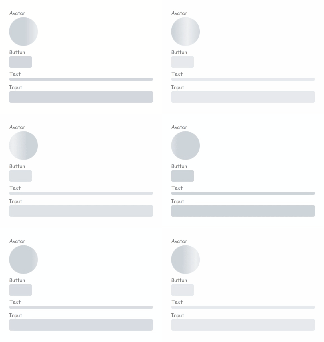
  <h3>Avatar</h3>
  <SkeletonShape type="avatar" animation="wave" />
  <h3>Button</h3>
  <SkeletonShape type="button" animation="fade-in" />
  <h3>Text</h3>
  <SkeletonShape type="text" animation="fade-in" />
  <h3>Input</h3>
  <SkeletonShape type="input" animation="fade-in" />
</template>
This would give u a diff. shapes :
Contributing
Contributions are always welcome!
you can share your custom shape, you can refactor code, you can fix bugs by
Creating A Pull Request
- Fork the Project
- Create your Feature Branch (
git checkout -b feature/FeatureName) - Commit your Changes (
git commit -m 'Add some feature description') - Push to the Branch (
git push origin feature/FeatureName) - Open a Pull Request
API
| Prop | Type | Default | Options | Description |
|---|---|---|---|---|
| width | number, string | '100%' | The is the width of the loader, and can be either a number or string. This property would be overridden if the size props is set |
|
| height | number, string | 16px | The is the height of the loader, and can be either a number or string. This property would be overridden if the size props is set |
|
| type | string | 'text' | text, button, avatar, input | This is the type of the loader. It could be circle or rectangle shaped |
| animation | string | 'fade-in' | fade-in, wave | The animation to be applied to the loader |
| radius | number | 12 | This is used to determine the border radius of the loader | |
| count | number | 1 | This is used to determine the number of the loader |
Give a Star
- Go to the repo easy-skeleton-loader-vue.
- Click on the
⭐ button in the top-right corner of the page.
Authors
- Ali Hassan - Software developer


