ca11y 

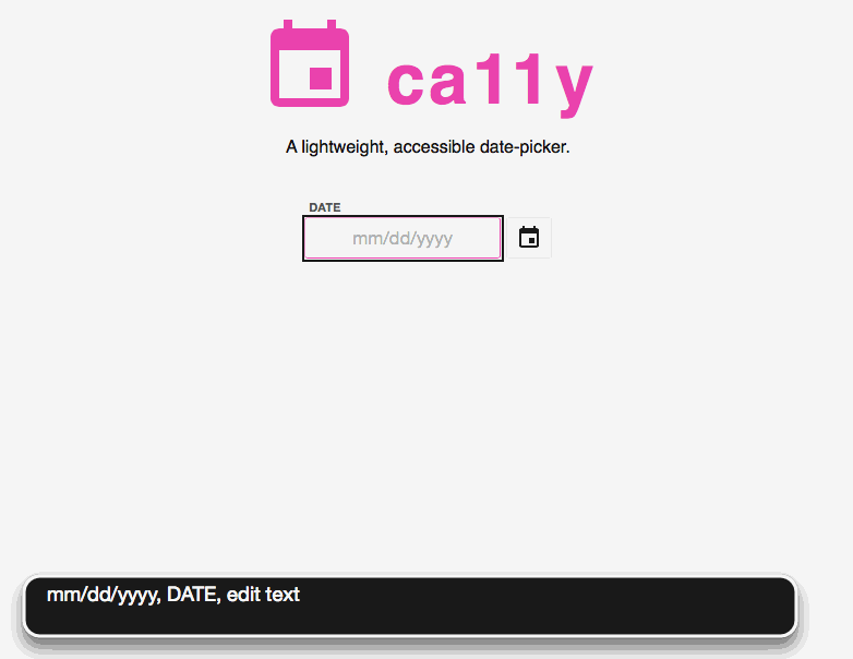
An accessible, light-weight, vanilla date picker < 6kb gzipped. Bring your own styles, or play off the demo.
npm install ca11y --save
This is a work in progress. Accessibility testing thus far has been through basic keyboard usage and Apple VoiceOver on OS X Safari. We would love more testing and advice from the community!
Feedback, pull requests, bug reports and ideas for improvement. Got some? Head on over to issues.
Usage
Multiple instances by css selector:
Ca11ySingle input element:
const input = documentconst datePicker = input optionsPass any of the options listed below to override the defaults.
Styling:
Ca11y just provides the markup and functionality. You're on the hook to provide css. Feel free to use the styles from the demo as a starting point. At the very least, you'll need to something like this to hide the date-picker when inactive:
}Options
Basic
options.container
const datePicker = input container: inputparentElement // defaultThe HTML element where you want the datepicker to render.
options.toggle
const datePicker = input toggle: thisuidatePicker // default (dynaically created)The HTML element that should toggle datepicker when clicked. Defaults to a dynamically created button.
options.format
const datePicker = input format: 'mm' 'dd' 'yyyy' // defaultA an Array of date codes to specify your desired format. Joined with options.delimiter.
Available formats:
| key | value |
|---|---|
| d | Day of the month as digits; no leading zero for single-digit days. |
| dd | Day of the month as digits; leading zero for single-digit days. |
| ddd | Day of the week as a three-letter abbreviation. |
| dddd | Day of the week as its full name. |
| m | Month as digits; no leading zero for single-digit months. |
| mm | Month as digits; leading zero for single-digit months. |
| mmm | Month as a three-letter abbreviation. |
| mmmm | Month as its full name. |
| yy | Year as last two digits; leading zero for years less than 10. |
| yyyy | Year represented by four digits. |
fullName and label values are read by screen readers. Provide transitionDuration if you are using the css transition property on the .ca11y__picker element to allow auto-focusing of the selected day on transition end.
options.delimiter
const datePicker = input delimiter: "/" // defaultThe String used to join the date segments defined in the options.format Array.
options.transitionDuration
const datePicker = input transitionDuration: 200 // defaultIf you are transitioning open and closing the calendar with CSS, specify the transitionDuration in milliseconds here.
options.autofill
const datePicker = input autofill: false // defaultSet to true if you want a blank input to be auto-filled with today's date.
options.onSelect
const datePicker = input onSelect: { inputvalue = value } // defaultThe function that runs whenever a date is selected. By default, it sets the input value to the selected date, formatted as defined by format and delimiter.
Language
options.months
const datePicker = input months: fullName: 'January' displayName: 'Jan' shortName: 'Jan' ...An Array of objects containing the fullName, displayName, and shortName of each month. fullName is what gets read by screen readers. displayName gets rendered to the calendar, and shortName is for usage with output formats. Override with other languages or desired text.
options.days
const datePicker = input days: fullName: 'Sunday' displayName: 'S' shortName: 'Sun' ... Same format as `months` Override with other languages or desired text #### `options.dayTitles````jsconst datePicker = new Ca11y(input, {dayTitles: [ 'First', 'Second', ...})Read aloud by screen readers when a date receives focus. Override with other languages or desired text.
options.dayTitles
const datePicker = input dayTitles: 'First' 'Second' ...Read aloud by screen readers when a date receives focus. Override with other languages or desired text.
UI
options.toggleIcon
const datePicker = input toggleIcon: "<svg>...</svg>" // defaults to Google material calendar iconThe icon to be rendered as the toggle button label. Defaults to svg iconography from https://design.google.com/icons/.
options.toggleAriaLabel
const datePicker = input toggleAriaLabel: "Toggle the Datepicker" // defaultThe aria-label that should be read by a screen reader when the (default) toggle button is focused.
options.next
const datePicker = input next: html: '<button>Next</button>' label: 'Next Month' The html will be rendered as the next month button. The label is screen-reader only. Defaults to svg iconography from https://design.google.com/icons/.
prev
const datePicker = input prev: html: '<button>Prev</button>' label: 'Previous Month' The html will be rendered as the previous month button. The label is screen-reader only. Defaults to svg iconography from https://design.google.com/icons/.
Advanced
parser
formatter
HTML5 Date Inputs and Ca11y
Ca11y upgrades standard text inputs to date-pickers. If you're interested in using the native HTML5 date-picker via <input type="date">, consider loading Ca11y based on a feature test, like this one (pulled from Modernizr):
{ var input = document input var isDate = inputtype !== 'text' && 'style' in input var testValue = '1)' if isDate inputvalue = testValue inputstylecssText = 'position:absolute;visibility:hidden;' isDate = inputvalue != testValue return isDate}Demo Locally
npm install
npm start
Deploy to GitHub Pages
npm run deploy
--
Check out other open source work happening at Viget on code.viget.com