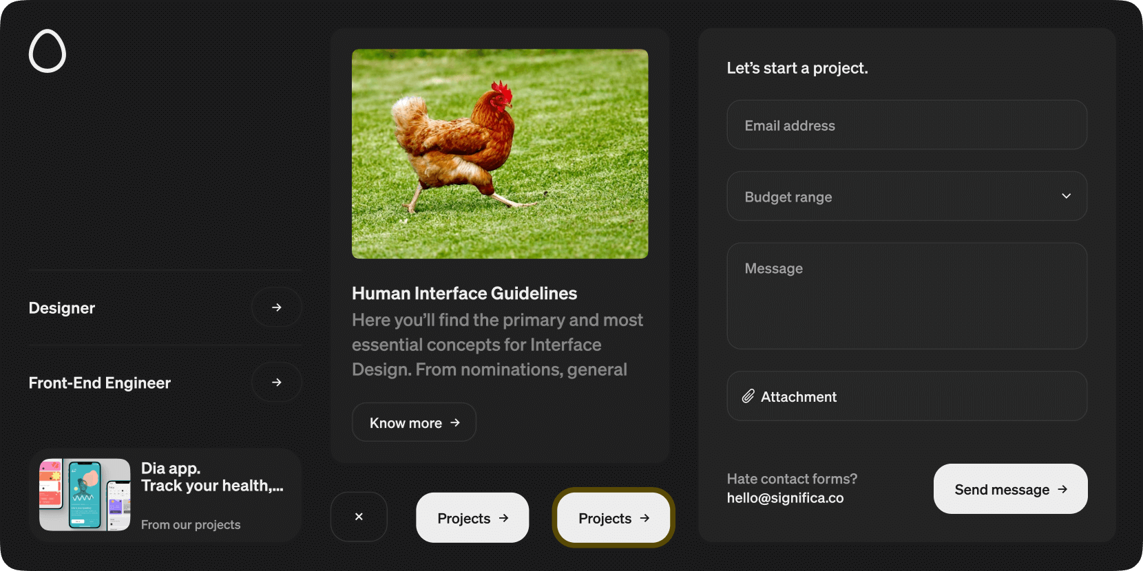
This project is responsible for Significa's Svelte UI library. Storybook preview available at svelte-ui.significa.co.
This package is published as @significa/significa-svelte-ui in the
NPM official registry and
GitHub package registry.
npm install --save @significa/svelte-ui
If you are using the GitHub package registry you might need to authenticate with the registry, see working with the npm registry for more information.
In your tailwind configuration file (tailwind.config.cjs), import our tailwind preset and update
the content key to include our package. Optionally (but ideally), you can include our brand fonts
by providing a path to your project's static font files.
/** @type {import('tailwindcss').Config} */
module.exports = {
  content: [
    './src/**/*.{html,js,svelte,ts}',
    './node_modules/@significa/svelte-ui/**/*.{html,js,svelte,ts}' // add this
  ],
  presets: [
    require('@significa/svelte-ui/tailwind-preset') // add this
  ],
  theme: {
    // your theme
  }
};If the project needs to include our brand fonts, you can call the preset defining custom fonts and their path:
module.exports = {
  presets: [
    require('@significa/svelte-ui/tailwind-preset')({
      fonts: {
        sans: {
          name: 'Significa Sans',
          fontFaces: [
            {
              fontWeight: '400',
              src: `url('/fonts/significa-regular.woff2') format('woff2')`,
              ascentOverride: '95%'
            },
            {
              fontWeight: '500',
              src: `url('/fonts/significa-medium.woff2') format('woff2')`,
              ascentOverride: '95%'
            },
            {
              fontWeight: '600',
              src: `url('/fonts/significa-semibold.woff2') format('woff2')`,
              ascentOverride: '95%'
            }
          ]
        }
      }
    })
  ]
};- Ensure you are using a compatible node version (see .nvmrc
and
node_versionsinci-cd.yaml). - Install the dependencies with
npm install. - Start Storybook's component preview server with
npm run storybook. Access it athttp://localhost:6006/.
Just create a new release with a semver
compliant name, prefixed by v. Ex: v1.2.3, v1.2.3-sample.

