


- 🧩 Automatically import components and styles on demand.
- ✨ Provide Some useful layout components.
- Add
@shuimo-design/shuimo-ui-nuxtdependency to your project
# Using pnpm
pnpm add -D @shuimo-design/shuimo-ui-nuxt

# Using yarn
yarn add --dev @shuimo-design/shuimo-ui-nuxt

# Using npm
npm install --save-dev @shuimo-design/shuimo-ui-nuxt- Add
shuimo-uito themodulessection ofnuxt.config.ts
export default defineNuxtConfig({
  modules: [
    '@shuimo-design/shuimo-ui-nuxt'
  ]
})
That's it! You can now use Shuimo UI in your Nuxt app ✨
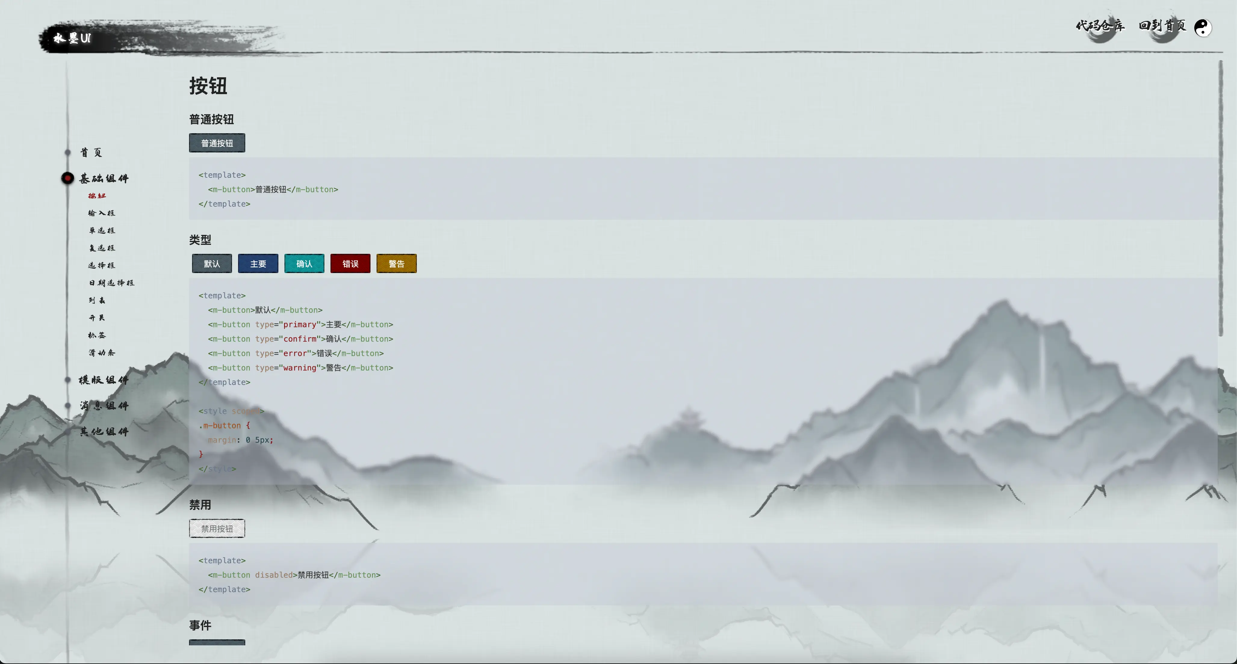
You can use shuimo-ui create a website like this:
We provide a component called MLoadingPreview.
you can used it when you want to do some time-consuming operations like preload some assets and show a loading animation.
<template>
  <div>
    <client-only>
      <MLoadingPreview v-model="isLoading" v-if="isLoading" :preInit="preInit"/>
    </client-only>
    <your-main-display-component v-if="!isLoading">

    </your-main-display-component>
  </div>
</template>


<script setup lang="ts">

  const isLoading = ref(true);

  const preInit = async () => {
    await import('ASSET_URL');
    // or other time-consuming operations
    return true;
  };
</script>