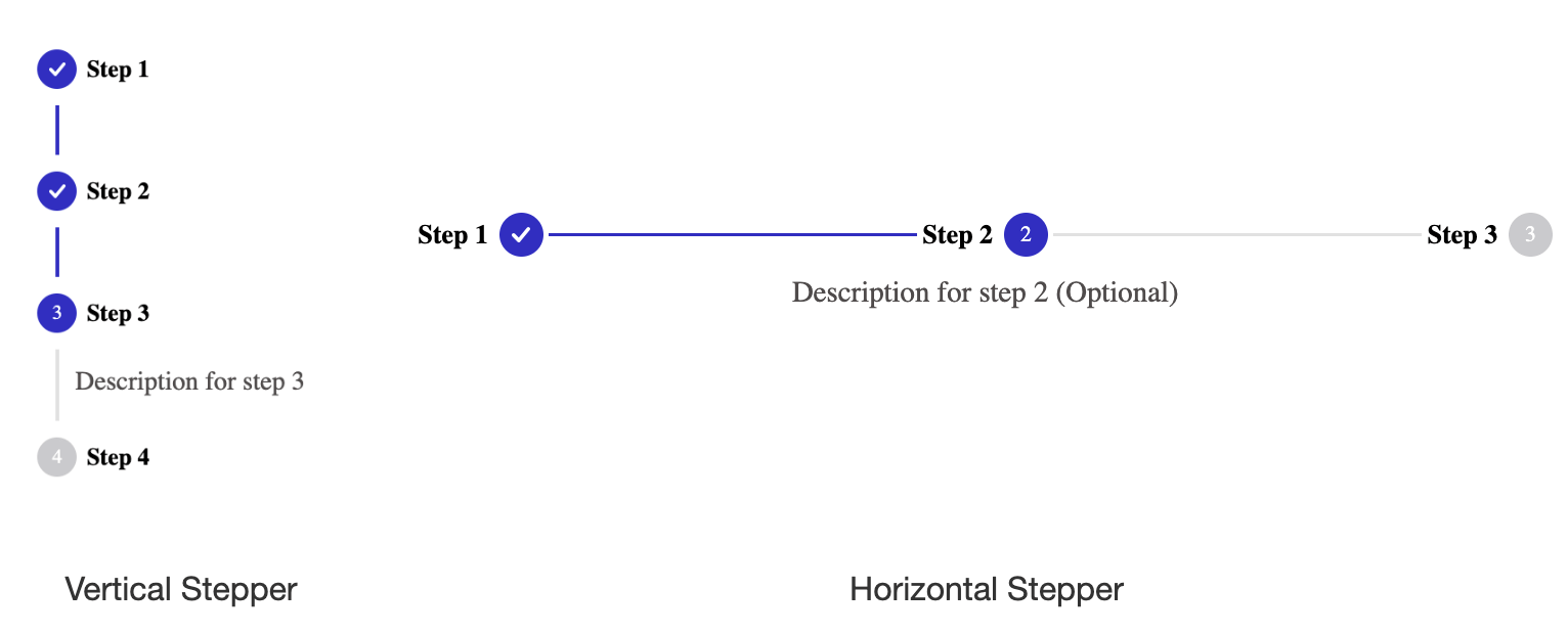
React Stepper
A fully customizable ready to use stepper UI package for React. Try tweaking a stepper using this codesandbox link here
Installation
The easiest way to use react-stepper-ui-component is to install it from npm and build it into your app with Webpack.
npm install @keyvaluesystems/react-stepperYou’ll need to install React separately since it isn't included in the package.
Note for Next.js users, if you are using Next.js version 13 or later, you will have to use the use client feature to ensure proper compatibility.
Usage
React Stepper can run in a very basic mode by just providing the steps and currentStepIndex props like this:
<Stepper
  steps={[
    {
      stepLabel: "Step 1",
      stepDescription: "This is Step 1",
      completed: true,
    },
    {
      stepLabel: "Step 2",
      stepDescription: "This is Step 2",
      completed: false,
    },
    {
      stepLabel: "Step 3",
      stepDescription: "This is Step 3",
      completed: false,
    },
  ]}
  currentStepIndex={1}
/>
The steps array is an array of objects with following keys:
-
stepLabel- A mandatory string representing the label/title of the step. -
stepDescription- Optional extra information or description for the step. -
completed- Boolean flag for indicating step completion status.
You can customize each step node with your own DOM element using the renderNode prop
<Stepper
  steps={stepsArray}
  currentStepIndex={currentStepIndex}
  renderNode={(step, stepIndex) => <div key={stepIndex}>{step.stepLabel}</div>}
/>
The step param provided by the renderNode callback is the same object you pass as array item in steps prop.
Props
Props that can be passed to the component are listed below:
| Prop | Description | Default |
|---|---|---|
steps: object[] |
An array of step objects to render. | undefined |
currentStepIndex: number |
The index of current active step. | 0 |
onStepClick?: (step: object, stepIndex: number): void |
A step click handler that fires each time you click on a step. | undefined |
renderNode?: (step: object, stepIndex: number): ReactElement |
A render function to customize each step node with your own element. | undefined |
orientation?: 'horizontal' | 'vertical' |
Determines the layout of the stepper. | vertical |
labelPosition?: 'left' | 'right' | 'top' | 'bottom' |
Allows you to align step label and description with respect to its node | right |
showDescriptionsForAllSteps boolean |
A boolean prop specifying whether to show descriptions for all steps within the stepper. | false |
stepContent(step: object, stepIndex: number): ReactElement |
Prop that allows for dynamic content display when the step is active | undefined |
styles?: object |
Provides you with a bunch of callback functions to override the default styles. | undefined |
Style Customizations
All the default styles provided by this package can be overridden using the styles prop
Below code shows how to override the default styles of completed steps, connector lines and current active step
import React from "react";
import Stepper from "react-stepper";

function App() {

  const styles = {
    LineSeparator: () => ({
      backgroundColor: "#028A0F",
    }),
    ActiveNode: () => ({
      backgroundColor: "#028A0F",
    }),
    CompletedNode: () => ({
      backgroundColor: "#028A0F",
  };

  return (
    <Stepper
      steps={stepsArray}
      currentStepIndex={currentStepIndex}
      styles={styles}
    />
  );
}

export default App;
Additional customizations can be made by overriding the customizable styles listed below:
const stylesOverride = {
    LabelTitle: (step, stepIndex) => ({ ...styles }),
    ActiveLabelTitle: (step, stepIndex) => ({ ...styles }),
    LabelDescription: (step, stepIndex) => ({ ...styles }),
    ActiveLabelDescription: (step, stepIndex) => ({ ...styles }),
    LineSeparator: (step, stepIndex) => ({ ...styles }),
    InactiveLineSeparator: (step, stepIndex) => ({ ...styles }),
    Node: (step, stepIndex) => ({ ...styles }),
    ActiveNode: (step, stepIndex) => ({ ...styles }),
    InActiveNode: (step, stepIndex) => ({ ...styles }),
};-
LabelTitle- overrides the step label style -
ActiveLabelTitle- overrides the step label style of current active step -
LabelDescription- overrides the step description style -
ActiveLabelDescription- overrides the step description style of current active step -
LineSeparator- overrides default completed step connector line styles -
InactiveLineSeparator- overrides styles of step connector line after current active step -
Node- overrides default styles of step indicator -
ActiveNode- overrides default styles of step indicator of current active step -
InActiveNode- overrides default styles of step indicator that is not completed and not active -
CompletedNode- overrides default styles of completed step indicator


