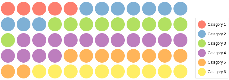
React Dot Matrix Chart
A customizable ready to use Dot Matrix Chart Component for React
Try tweaking a dot matrix using this codesandbox link here
Installation
The easiest way to use react-dot-matrix-chart is to install it from npm and build it into your app with Webpack.
npm install @keyvaluesystems/react-dot-matrix-chartYou’ll need to install React separately since it isn't included in the package.
Note for Next.js users, if you are using Next.js version 13 or later, you will have to use the use client feature to ensure proper compatibility.
Usage
React Dot Matrix Chart can run in a very basic mode by just providing the dataPoints like given below:
import DotMatrix from "@keyvaluesystems/react-dot-matrix-chart";

<DotMatrix dataPoints={dataPointsArray} />;
The datapoints is an array of objects with the following keys:
-
name- a string that represents each category -
count- a number to specify the count of each category present(used to find the number of dots to be displayed) -
color- a string to specify which colour to be used to represent the category in the dot matrix
An example for dataPoints array is shown below:
const dataPointsArray = [
  {
    name: "Category 1",
    count: 10,
    color: "gray"
  },
  {
    name: "Category 2",
    count: 10,
    color: "black"
  },
  {
    name: "Category 3",
    count: 10,
    color: "green"
  }
];
You can specify the number of rows or columns to be present in the chart as well using the dimensions prop.
<DotMatrix
  dataPoints={dataPointsArray}
  dimensions={{
    rows: 5,
    columns: 10
  }}
/>
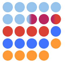
If the count given in the dataPoints array results in a partial percentage (decimal value), a gradient dot will be displayed as shown below
Props
Props that can be passed to the component are listed below:
| Prop | Description | Default |
|---|---|---|
dataPoints: object[] |
An array of category objects to specifying the count and name of each section | undefined |
dimensions?: object |
To specify the number of rows and columns to be present in the chart | { rows: 5, columns: 12 } |
spaceBetweenDots?: number |
To specify the distance between each dot | 4 |
showLegend?: boolean |
To specify whether to show the legend or not | false |
legendPosition?: 'left' | 'left-start' | 'left-end | 'right' | 'right-start' | 'right-end' | 'top'| 'top-start' | 'top-bottom' | 'bottom' | 'bottom-start' | 'bottom-end' |
To specify the position of the legend. | right-end |
styles?: object |
Provides you with a bunch of callback functions to override the default styles. | undefined |
Style Customizations
All the default styles provided by this package are overridable using the styles prop.
the below code shows all the overridable styles:
<DotMatrix
  dataPoints={dataPointsArray}
  styles={{
    Container: () => ({ ...styles }),
    DotsContainer: () => ({ ...styles }),
    Dot: () => ({ ...styles }),
    LegendContainer: () => ({ ...styles }),
    LegendName: () => ({ ...styles }),
    LegendDot: () => ({ ...styles })
  }}
/>-
Container- Overrides the dot matrix chart container style -
DotsContainer- Overrides the dot matrix chart dots container style -
Dot- Overrides the style of each dot in the chart -
LegendContainer- Overrides the legend (details) container style -
LegendName- Overrides the legend name style -
LegendDot- Overrides the legend dot style


