
FlexLayout Extended
This fork extends the existing flexlayout-react library with additional features.
Notes from the Contributor
Hello, there. You might be wondering, "What the fork? What's going on?"
Terrible joke, I know.
To put it simply: It's a version of FlexLayout (a.k.a. flexlayout-react on NPM) which is still very much a work in progress. Currenly, I'm developing a feature which will support docking & undocking of tabs.

Premise and Objective
If you're in dire need of a React.js library that supports tabsets which can both be separated on the grid and float freely one the screen, then this extended library is most likely for you.
Where to start? / Installation / Usage
For the installation & usage, check the original docs below. I've made some additional details based on what I've contributed so far.
This fork contains additional features not included in the original. It is currently being pitched as a proof of concept at https://github.com/caplin/FlexLayout/issues/61. To use this specific fork in your projects, follow these commands:
npm install react --save
npm install react-dom --save
npm install react-rnd --save # This dependency is needed for the free-floating tabs
npm install @andrewsantarin/extended-flexlayout-react --save
Then, follow the rest of the docs as usual.
If you want to see this library's tie-in examples, then do this:
git clone https://github.com/andrewsantarin/FlexLayout.git
cd FlexLayout
git checkout -b branch origin/wip/<the-wip-branch-name>
npm install
npm start
Replace the wip/<the-wip-branch-name> with any particular development branch I'm working on. If you want to see what's in store for this library, don't look at the master branch. Instead, refer to one of these three groups:
-
develop- merge of allfeaturecommits -
feature- polished up commits -
wip- totally new stuff, very unstable
Once you run npm start, wait for the webpack bundler to finish, then open http://localhost:3000 on your local browser.
Normal docs continue below!
FlexLayout
FlexLayout is a layout manager that arranges React components in multiple tab sets, these can be resized and moved.

Try it now using JSFiddle
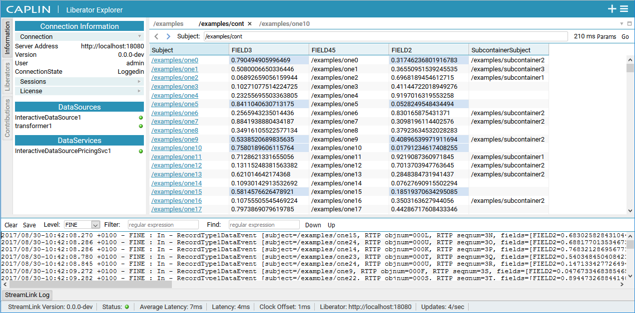
Screenshot of Caplin Liberator Explorer using FlexLayout
FlexLayout's only dependency is React.
Features:
- splitters
- tabs
- tab dragging and ordering
- tabset dragging (move all the tabs in a tabset in one operation)
- dock to tabset or edge of frame or (NEW!) free-floating space
- maximize tabset (double click tabset header or use icon)
- tab overflow (show menu when tabs overflow)
- border tabsets
- floating tabsets (NEW!)
- submodels, allow layouts inside layouts
- tab renaming (double click tab text to rename)
- theming - light and dark
- touch events - works on mobile devices (iPad, Android)
- add tabs using drag, indirect drag, add to active tabset, add to tabset by id
- preferred pixel size tabsets
- tabset with headers
- tab and tabset attributes: enableHeader, enableTabStrip, enableDock, enableDrop...
- customizable tabs and tabset header rendering
-
[esc]key to cancel drag - typescript type declarations
- supports overriding css class names via the classNameMapper prop, for use in css modules
Installation
FlexLayout is in the npm repository. Simply install React and FlexLayout from npm:
npm install react --save
npm install react-dom --save
npm install flexlayout-react --save
Import React and FlexLayout in your modules:
import React from "react";
import ReactDOM from "react-dom";
import FlexLayout from "flexlayout-react";
Include the light or dark style in your html:
Light
<link rel="stylesheet" href="node_modules/flexlayout-react/style/light.css" />
Dark:
<link rel="stylesheet" href="node_modules/flexlayout-react/style/dark.css" />
Usage
The <Layout> component renders the tabsets and splitters, it takes the following props:
| Prop | Required/Optional | Description |
|---|---|---|
| model | required | the layout model |
| factory | required | a factory function for creating React components |
| onAction | optional | function called whenever the layout generates an action to update the model (allows for intercepting actions before they are dispatched to the model, e.g.: asking the user to confirm a tab close) |
| onRenderTab | optional | function called when rendering a tab, allows leading (icon) and content sections to be customized |
| onRenderTabSet | optional | function called when rendering a tabset, allows header and buttons to be customized |
| onModelChange | optional | function called when model has changed |
| classNameMapper | optional | function called with default css class name, return value is class name that will be used. Mainly for use with css modules. |
The model is tree of Node objects that define the structure of the layout.
The factory is a function that takes a Node object and returns a React component that should be hosted by a tab in the layout.
The model can be created using the Model.fromJson(jsonObject) static method, and can be saved using the model.toJson() method.
this.state = {model: FlexLayout.Model.fromJson(json)};

render() {
  <Layout model={this.state.model} factory={factory}/>
}
Example Configuration
Consider this typical use case and its implementation code below:
- You want a main layout that has two groups of tabs, split evenly in the middle.
- You also want another tab to float freely over the main layout, which can be moved around at the user's discretion.
- You also want yet another set of panels which contain docked tabs on all four sides of your main layout.
const json = {
  global: {},
  layout: {      // Required
    type: "row", // Also required.
    weight: 100, // Also required.
    children: [
      // Optional children elements.
      // If you'd rather not have any elements on this layer, leave the "children" array empty.
      {
        type: "tabset",
        weight: 50, // Not in pixels, but rather, a relative ratio between the children of the same parent.
        selected: 0,
        children: [
          {
            type: "tab",
            name: "FX",
            component: "grid",
          }
        ],
      },
      {
        type: "tabset",
        weight: 50, // Not in pixels, but rather, a relative ratio between the children of the same parent.
        selected: 0,
        children: [
          {
            "type": "tab",
            "name": "FI",
            "component": "grid",
          },
        ],
      },
    ],
  },
  floating: {         // Required
    type: "floating", // Also required.
    children: [ 	    // Also required.
      // Optional children elements.
      // If you'd rather not have any elements on this layer, leave the "children" array empty.
      // You may only nest tabsets up to 1 level from the floating element.
      {
        type: "tabset",
        // Use the following on the tabset instead of "weight".
        x: 125,			    // From the topmost pixel of the layout root element.
        y: 250,			    // From the leftmost pixel of the layout root element.
        width: 600,		  // Initial pixel width of the child element.
        height: 480,	  // Initial pixel height of the child element.
        // ------------ //
        selected: 0,
        children: [
          {
            type: "tab",
            name: "FX",
            component: "grid",
          },
        ],
      },
    ],
  },
  "borders": [ // Optional
    // You can specify up to 4 borders in total across 4 sides.
    // 1 border = 1 side
    {
      "type": "border",
      "location": "top",
      "children": [
        {
          "type": "tab",
          "enableClose": false,
          "name": "Navigation",
          "component": "grid"
        }
      ]
    },
    {
      "type": "border",
      "location": "left",
      "children": [
        {
          "type": "tab",
          "enableClose": false,
          "name": "Views",
          "component": "grid"
        }
      ]
    },
    {
      "type": "border",
      "location": "right",
      "children": [
        {
          "type": "tab",
          "enableClose": false,
          "name": "Options",
          "component": "grid"
        }
      ]
    },
    {
      "type": "border",
      "location": "bottom",
      "children": [
        {
          "type": "tab",
          "enableClose": false,
          "name": "Activity Blotter",
          "component": "grid"
        },
        {
          "type": "tab",
          "enableClose": false,
          "name": "Execution Blotter",
          "component": "grid"
        }
      ]
    }
  ]
};
Example Code
import React from "react";
import ReactDOM from "react-dom";
import FlexLayout from "flexlayout-react";

// Let's assume that the example configuration above is what we want.
import MAIN_LAYOUT_JSON from "./main.layout.json";

class Main extends React.Component {
  constructor(props) {
    super(props);

    this.state = {
      model: FlexLayout.Model.fromJson(MAIN_LAYOUT_JSON),
    };
  }

  factory = (node) => {
    const component = node.getComponent();
    if (component === "button") {
      return <button>{node.getName()}</button>;
    }
  }

  render() {
    return (
      <FlexLayout.Layout model={this.state.model} factory={this.factory}/>
    )
  }
}

ReactDOM.render(<Main/>, document.getElementById("container"));
The above code would render two tabsets horizontally each containing a single tab that hosts a button component. The tabs could be moved and resized by dragging and dropping. Additional grids could be added to the layout by sending actions to the model.
If you're looking for more advanced implementations to exert additional control over your layout, see our examples.
Try it now using JSFiddle
Core Concept
The model revolves around 4 types of "node":
-
row
Rows contain a list of tabsets and child rows. The top level row will render horizontally, while child "rows" will render in the opposite orientation to their parent.
Note: Rows can't be nested in on
floatingandborder. -
tabset
Tabsets contain a list of tabs and the index of the selected tab.
-
tab
Tabs specify the name of the component that they should host (that will be loaded via the factory) and the text of the actual tab.
-
border
Borders contain a list of tabs and the index of the selected tab; they can only be used in the border's top level element.
The main layout is defined with rows within rows that contain tabsets that themselves contain tabs.
The model json contains 4 top level elements:
-
globalwhere global options are defined.
-
layoutwhere the grid-separated
row -> tabset -> tabslayout hierarchy is defined. -
floatingwhere the free-floating
tabset -> tabshierarchy is defined. -
(optional)
borderswhere up to 4 borders are defined (i.e. the
"top","bottom","left","right"sides), one border for each side.
Weights on rows and tabsets specify the relative weight of these nodes within the parent row. The actual pixel values do not matter; their relative values will be calculated instead (i.e. two tabsets of weights 30,70 relative their parent element would render the same if they had weights of 3,7).
To control where nodes can be dropped, you can add a callback function to the model:
model.setOnAllowDrop(this.allowDrop);Example:
class Main extends Component {
  allowDrop = (dragNode, dropInfo) => {
    let dropNode = dropInfo.node;

    // prevent non-border tabs dropping into borders
    if (dropNode.getType() == "border" && (dragNode.getParent() == null || dragNode.getParent().getType() != "border")) {
      return false;
    }

    // prevent border tabs dropping into main layout
    if (dropNode.getType() != "border" && (dragNode.getParent() != null && dragNode.getParent().getType() == "border")) {
      return false;
    }

    return true;
  }
}
By changing global or node attributes you can change the layout appearance and behavior.
For example, setting tabSetEnableTabStrip to false in the global options would change the layout into a multi-splitter (without
tabs or drag and drop).
{
  "global": {
    "tabSetEnableTabStrip": false
  }
}
Global Config attributes
Attributes allowed in the global element
| Attribute | Default | Description |
|---|---|---|
| splitterSize | 8 |
|
| enableEdgeDock | true |
|
| tabEnableClose | true |
|
| tabEnableDrag | true |
|
| tabEnableRename | true |
|
| tabClassName | null |
|
| tabIcon | null |
|
| tabEnableRenderOnDemand | true |
|
| tabDragSpeed | 0.3 |
CSS transition speed of drag outlines (in seconds) |
| tabSetEnableDeleteWhenEmpty | true |
|
| tabSetEnableDrop | true |
|
| tabSetEnableDrag | true |
|
| tabSetEnableDivide | true |
|
| tabSetEnableMaximize | true |
|
| tabSetClassNameTabStrip | null |
|
| tabSetClassNameHeader | null |
|
| tabSetEnableTabStrip | true |
|
| tabSetHeaderHeight | 20 |
|
| tabSetTabStripHeight | 20 |
|
| borderBarSize | 25 |
|
| borderEnableDrop | true |
|
| borderClassName | null |
Row Attributes
Attributes allowed in nodes of type "row".
| Attribute | Default | Description |
|---|---|---|
| type | "row" |
|
| weight | 100 |
|
| width | null |
preferred pixel width |
| height | null |
preferred pixel height |
| children | required | a list of row and tabset nodes |
Tab Attributes
Attributes allowed in nodes of type "tab".
Inherited defaults will take their value from the associated global attributes (see above).
| Attribute | Default | Description |
|---|---|---|
| type | "tab" |
|
| name | required | |
| component | required | |
| config | null |
a place to hold json config for the hosted component |
| id | auto generated | |
| enableClose | inherited | |
| enableDrag | inherited | |
| enableRename | inherited | |
| className | inherited | |
| icon | inherited | |
| enableRenderOnDemand | inherited |
Tab nodes have a getExtraData() method that initially returns an empty object. This is the place to
add extra data to a tab node that will not be saved.
TabSet Attributes
Attributes allowed in nodes of type "tabset".
Inherited defaults will take their value from the associated global attributes (see above).
Note: tabsets can be dynamically created as tabs are moved and deleted when all their tabs are removed (unless enableDeleteWhenEmpty is false).
| Attribute | Default | Description |
|---|---|---|
| type | "tabset" |
|
| weight | 100 |
|
| width | null |
preferred pixel width |
| height | null |
preferred pixel height |
| x | null |
preferred pixel offset from the leftmost corner of the <Layout> container, equivalent of CSS left
|
| y | null |
preferred pixel offset from the topmost corner of the <Layout> container, equivalent of CSS top
|
| name | null |
named tabsets will show a header bar above the tabs |
| selected | 0 |
|
| maximized | false |
|
| id | auto generated | |
| children | required | a list of tab nodes |
| enableDeleteWhenEmpty | inherited | |
| enableDrop | inherited | |
| enableDrag | inherited | |
| enableDivide | inherited | |
| enableMaximize | inherited | |
| classNameTabStrip | inherited | |
| classNameHeader | inherited | |
| enableTabStrip | inherited | |
| headerHeight | inherited | |
| tabStripHeight | inherited |
Tab set nodes will use certain positioning, size and relative split variables depending on where it has been nested:
-
weightwhen nested insidelayout -
width,height,x,ywhen nested insidefloating
Border Attributes
Attributes allowed in nodes of type "border".
Inherited defaults will take their value from the associated global attributes (see above).
| Attribute | Default | Description |
|---|---|---|
| type | "border" |
|
| size | 200 |
size of the tab body when selected |
| selected | -1 |
-1 = unselected |
| id | auto generated |
"border_" + border name, e.g. "border_left"
|
| show | true |
show/hide this border |
| children | required | a list of tab nodes |
| barSize | inherited | |
| enableDrop | inherited | |
| className | inherited |
Model Actions
All changes to the model are applied through actions. You can intercept actions resulting from GUI changes before they are applied by implementing the onAction callback property of the <Layout> component. You can also apply actions directly using the Model.doAction() method.
Example
model.doAction(Actions.updateModelAttributes({
  splitterSize: 40,
  tabSetHeaderHeight: 40,
  tabSetTabStripHeight: 40
}));
The above example would increase the size of the splitters, tabset headers and tabs. This could be used to make adjusting the layout easier on a small device.
| Action Creator | Description |
|---|---|
| Actions.addNode(newNodeJson, toNodeId, location, index) | add a new tab node to the given tabset node |
| Actions.moveNode(fromNodeId, toNodeId, location, index) | move a tab node from its current location to the new node and location |
| Actions.deleteTab(tabNodeId) | delete the given tab |
| Actions.selectTab(tabNodeId) | select the given tab |
| Actions.setActiveTabset(tabsetNodeId) | set the tabset as the active tabset |
| Actions.adjustSplit(splitterNodeId, value) | adjust the size of the given splitter |
| Actions.maximizeToggle(tabsetNodeId) | toggles whether the given tabset node is maximized |
| Actions.updateModelAttributes(attributes) | updates the global attributes |
| Actions.updateNodeAttributes(nodeId, attributes) | updates the attributes of the given node |
| Actions.adjustBorderSplit(borderNodeId, pos) | updates the size of the given border node |
Example:
model.doAction(Actions.addNode(
  { // Your new tab.
    type: "tab",
    component: "grid",
    name: "a grid",
    id: "5"
  },
  "1",
  DropLocation.CENTER,
  0
));
This code would add a new grid component to the center of tabset with id "1" and at the 0'th tab position (use value -1 to add to the end of the tabs).
Note: You can get the id of a node using the method node.getId(). If an id wasn't assigned when the node was created, then one will be created for you of the form #<next_available_id> (e.g. #1, #2 ...).
Layout Component Methods to Create New Tabs
Methods on the Layout Component for adding tabs. The tabs are specified by their layout configuration in json.
Example:
this.refs.layout.addTabToTabSet(
  "NAVIGATION",
  { // Your new tab.
    type: "tab",
    component: "grid",
    name: "a grid"
  }
);
This would add a new grid component to the tabset with id "NAVIGATION".
| Layout Method | Description |
|---|---|
| addTabToTabSet(tabsetId, json) | adds a new tab to the tabset with the given id |
| addTabToActiveTabSet(json) | adds a new tab to the active tabset |
| addTabWithDragAndDrop(dragText, json, onDrop) | adds a new tab by dragging a marker to the required location; the drag takes effect immediately |
| addTabWithDragAndDropIndirect(dragText, json, onDrop) | adds a new tab by dragging a marker to the required location; the marker is shown and must be clicked on to start dragging |
Tab Node Events
You can handle events on nodes by adding a listener. This would typically be done in the class component's constructor() method.
Example:
class Main extends Component {
  constructor(props) {
    super(props);
    let config = this.props.node.getConfig();

    // save state in flexlayout node tree
    this.props.node.setEventListener("save", function (p) {
      config.subject = this.subject;
    }.bind(this));
  }
}| Event | parameters | Description |
|---|---|---|
| resize | called when tab is resized during layout, called before it is rendered with the new size | |
| close | called when a tab is closed | |
| visibility | called when the visibility of a tab changes | |
| save | called before a tabnode is serialized to json, use to save node config by adding data to the object returned by node.getConfig() |
Building the Project
To compile the project just run webpack in the top level directory, this will compile and bundle flexlayout and the examples into the bundles dir. Once compiled the examples can be run by opening their index.html files.
To build the npm distribution run 'npm run build', this will create the artifacts in the dist dir.