Declarative Animations for React Native
Declan is a library that makes it easy to incorporate declarative animations and interactions into your React Native app. It's inspired heavily by the UX language created by Fuse.
Demos
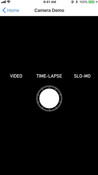


Run the demo app on Expo
https://expo.io/@akalyan/examples
Build and run the demo app on your computer
Clone the repo and run:
cd examples
yarn
yarn start
...then scan the QR code in the Expo app.
Installation
npm install --save react-native-declan
or
yarn add react-native-declan
Usage
We suggest reading the Fuse documentation for Animations to get a better sense for what react-native-declan strives to be and how to implement compelling user interactions with a truly declarative API. In lieu of that, here is a summary.
There are several entities that react-native-declan comprises:
Animators - descriptions of how components changeTriggers - stimuli that invoke change, wrap a set ofAnimators- Higher-Order
Animators - like the offspring ofAnimatorandTrigger, wrap and invoke a set ofAnimators, but also behave like anAnimator Components- what will changeBehaviors- giveComponents capabilities or detects gestures that are used byTriggers
Animators
Animators describe how components will change. There are a handful of basic animators to use: Move, Rotate, Scale, Fade.
New, more complex, animators can be built by combining those basic animators. For an example of this, see the Shake. These new animators should have the same behavior as the basic animators.
Animators essentially wrap the Animated.timing API twice -- once running forward, and another running backward.
Example:
<Move
  getTargetRef={() => elementToMove}
  x={80}
  duration={1000}
  easing={Easing.bounce}
  durationBack={500}
  easing={Easing.linear}
/>
The above snippet describes a movement of the component referenced by elementToMove, which will move right 80 pixels over 1 second with a bounce easing curve...when triggered.
Supported Animators
| Name | Props | Description | Notes |
|---|---|---|---|
Move |
x: number, y: number |
Translate by x or y or both |
- |
Scale |
x: number, y: number, factor: number |
Scale by x or y or factor (both) from center of AnimatableView |
- |
Rotate |
degrees: number, degreesX: number, degreesY: number, degreesZ: number |
Rotate reference AnimatableView by props from center |
degrees is an alias of degreesZ |
Fade |
value: number |
Chance opacity of referenced AnimatableView to value |
- |
Change |
field: string, value: number |
Chance a style property field of referenced AnimatableView to value |
(1) Only one of these can apply to an AnimatableView, (2) This Animator does not use the native driver, so use sparingly! |
DebugAction |
message: string |
Just prints the message to the console (does nothing in reverse) | - |
Callback |
action: () => any |
Calls the action (does nothing in reverse) | - |
All of the visual Animators above (Move, Scale, Rotate, Fade, Change) also take the following props:
| Prop | Type | Description |
|---|---|---|
getTargetRef |
() => AnimatableView |
Function that returns the AnimatableView the Animator should apply to |
initialValue |
number or { x: number, y: number } |
Depending on the type of Trigger used, you may need to specify where the Animator should return to. Some just take a value (e.g. Fade), while others take x and y (e.g. Move) |
onFinish |
() => void | Callback called when Animator finishes playing forward |
onFinishBack |
() => void | Callback called when Animator finishes playing backward |
duration |
number | Duration of forward animation |
durationBack |
number | Duration of backward animation |
delay |
number | Delay before starting forward animation |
delayBack |
number | Delay before starting backward animation |
easing |
Easing |
Easing function to apply to forward animation |
easingBack |
Easing |
Easing function to apply to backward animation |
extrapolate |
'extend' or 'clamp' |
Extrapolation setting for driver-based Animator |
extrapolateLeft |
'extend' or 'clamp' |
Extrapolation setting for driver-based Animator |
easingBack |
'extend' or 'clamp' |
Extrapolation setting for driver-based Animator |
Triggers
Triggers actually cause change to happen. This is where we take the user's actions into account. There are three types of triggers:
- Pulse triggers - play a set of animators forward
- While triggers - play forward while a condition is met, and play backward otherwise
- Gesture-responsive triggers - animators that play in response to, and in proportion to, some user gesture
Supported triggers
| Name | Props | Description | Notes |
|---|---|---|---|
ManualTrigger |
- | A wrapper for a set of Animators that you can trigger by calling .start() |
- |
Mounted |
- | Triggers its Animators when this trigger is mounted |
Put this at the bottom of the component tree to ensure it mounts last |
WhileTrue |
value: boolean |
Triggers its Animators when value evaluates to true, stops the Animators when false |
- |
ScrollPositionAnimation |
from: number, to: number, driver: ScrollDriver |
Gesture-based trigger that plays its Animators forward when ScrollView is scrolled from from to to |
See Scroll Position Demo for an example of how to hook it up to the ScrollView |
WhileScrolling |
direction: up, down, or either, driver: ScrollDriver |
Plays forward when associated ScrollView is scrolling in direction, otherwise plays backward |
See Scroll Direction Demo for an example of how to hook it up to the ScrollView |
StateGroup |
defaultState: string |
This is a sort of wrapper Trigger for State |
Trigger a specific state by calling goToState on this component's ref |
State |
name: string |
Will trigger its Animators when parent StateGroup changes to this state, and play backward when changed away from this state |
- |
SwipingAnimation |
getSourceRef: () => SwipeGesture |
Plays forward when associated SwipeGesture is swiped forward and returns to resting state when going backward |
See Swipe Demo for examples of how to hook it up to a swipe-able view |
Swiped |
getSourceRef: () => SwipeGesture, how: toActive, toInactive, or toEither |
Triggered when the associated SwipeGesture is swiped |
See Swipe Demo for examples of how to hook it up to a swipe-able view |
Higher-Order animators
| Name | Props | Description |
|---|---|---|
Parallel |
- | When started, plays all its children forward, when stopped plays them backward |
Cycle |
- | Plays its children Animators playing forward, and restarts them all when the last one finishes playing |
Sequence |
- | Plays each child Animator forward one-by-one (when the first finishes, second one beings, etc.) |
Stagger |
eachDelay: number |
When started, plays each child Animator with delay eachDelay between then, same behavior on stop |
All of the higher-order components also pass onto its children the following properties:
getTargetRefxyinitialValuevaluedurationeasingdelaydurationBackeasingBackdelayBack
See the Stagger Demo for usage example.
Components
Finally, react-native-declan has a set of components that can be manipulated through animators and triggers. Right now, the only component is a static view, but that will soon change.
Behaviors
Note: this may change in the future as we determine whether the
Behaviormodel or theDrivermodel is more appropriate for react-native.
| Name | Prop | Description |
|---|---|---|
SwipeGesture* |
type: active |
Only type supported right now |
direction: left, right, up, or down |
Direction to detect the swipe. Will also detect a swipe in the opposite direction to go back to inActive state |
|
length: number |
How long does the user need to swipe for it be considered "successful" (note, also fast swipes will count as success) | |
edge: left, right, top, bottom |
To only enable swipes from the edge of an element | |
hitSize: number |
For edge, how far from the edge is in play to start the gesture |
|
* See Swipe Demo for examples of how to hook it up to a swipe-able view by using the PanEventEmitter |
Contributing
If you are interested in contributing to react-native-declan or have feedback, please contact us. Pull requests are also welcome.