React Circular Slider Bar
Enjoy a circular slider bar component for React with no unnecessary dependencies
Key Features:
- Simple to use
- Highly customizable
- No extra dependencies
- Style based: no images / SVGs
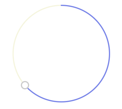
Check the demo!
Getting started
install
npm install --save-dev react-circular-slider-bar
usage example
import React from 'react';
import CircularSlider from 'react-circular-slider-bar';

const myApp = () => (
  <div>
    ...my awesome stuff...
    <CircularSlider
      r={50}
      trackWidth={10}
      thumbWidth={10}
      onChange={value => console.log(value)}
    />
  </div>
);

export default myApp;
controlled component
<CircularSlider
  value={this.state.value}
  onChange={value => this.setState({ value })}
/>
Props
| prop | type | deafult |
|---|---|---|
| r | number | 80 |
| initialAngle | number | 90 |
| value | number | undefined |
| trackWidth | number | 2 |
| trackColor | string | #f5f5dc |
| arcColor | string | #7985f1 |
| thumbWidth | number | 10 |
| thumbColor | string | white |
| thumbBorderWidth | number | 2 |
| thumbBorderColor | string | #cccccc |
| onChange | func | value => {} |