React bootstrap tools
Please note: This project is under start-up process. Inconsistencies, fails or any collapses are highly possible until project will reach v. 1.0.0 stepstone.


React bootstrap tools are bundle of tools build on top of react-bootstap components. They are customisable components ready to use on any webpage.
Package contains:
DescribedComponentto describe given html element using TooltipDescribedButtonto describe Button using TooltipGlyphiconto provide Material iconAlertBoxto show small message boxAlertBoxGroupto group AlertBox components
Available utilities connected withAlertBoxGroupcomponent:addAlertfor managing addition of an alertdismissAlertfor managing dismissal of an alert
Avatarto show user avatar
For more info about each component please refer to it's readme.md file.
Installation
Install dependency on your project
npm install react-bootstrap-tools
Import any package to your component
import { DescribedComponent, DescrbedButton, Glyphicon } from "react-bootstrap-tools";
Use it directly on your component
<DescribedComponent description="description text">
    <p>html element</p>
</DescribedComponent>
Styling
Import stylesheet into starting component of your application, or everywhere you import any element of React bootstrap tools package. Please refer to component's documentation to find out if it exposes any internal class name.
import "react-bootstrap-tools/build/static/css/index.css";
Third party styling
React bootstrap tools does not ship with any 3rd party styling.
In order to provide Bootstap's default stylesheet attach it onto head section of your html document.
Check more info here
<link rel="stylesheet" href="https://stackpath.bootstrapcdn.com/bootstrap/4.2.1/css/bootstrap.min.css" integrity="sha384-GJzZqFGwb1QTTN6wy59ffF1BuGJpLSa9DkKMp0DgiMDm4iYMj70gZWKYbI706tWS" crossorigin="anonymous">
If you use any component consuming Material icon, especially:
GlyphiconcomponentDescribedButtonwithiconpropAlertBoxwithwithIconpropAvatarwith nosrcprop
In order to see graphical icons attach icons definition onto head section of your html document. Check more info here
<link href="https://fonts.googleapis.com/icon?family=Material+Icons" rel="stylesheet">
Usage
Workable examples are available on sub-folders of src/lib/examples/ folder. You can import those examples directly to demo application (see Development section below).
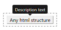
DescribedComponent
Wrapper for describing given html portion using Bootstrap's Tooltip component.
Example of usage
import React from 'react';
import { DescribedComponent } from 'react-bootstrap-tools';

const SimplestExample = () => (
    <DescribedComponent description="description text">
        <p>html element</p>
    </DescribedComponent>
);

export default SimplestExample;
Available optional props
- string
description: Description text to put insideTooltipcomponent - string
className: Additional class name to custom your styling of aTooltipcomponent. Styling example forNewStyle:.NewStyle > .tooltip-inner { background-color: yellow; color: black; } .NewStyle.bs-tooltip-top .arrow::before { border-top-color: yellow !important; } .NewStyle.bs-tooltip-right .arrow::before { border-right-color: yellow !important; } .NewStyle.bs-tooltip-bottom .arrow::before { border-bottom-color: yellow !important; } .NewStyle.bs-tooltip-left .arrow::before { border-left-color: yellow !important; } - string
placement: Position of aTooltipover component it describes.
Available options:- auto-start
- auto
- auto-end
- top-start
- top
- top-end
- right-start
- right
- right-end
- bottom-end
- bottom
- bottom-start
- left-end
- left
- left-start
- number
delay: Number of milliseconds theTooltipcomponent will appear and hide after describing component hover. - boolean
defaultShow: Settruewill initialise component with visible description - string
trigger: Action necessary to take over component to initialise visibility of description.
Available options:- hover
- click
- focus
- Array<hover, click, focus>
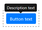
DescribedButton
Wrapper for describing Bootstrap's Button using Tooltip component. It also handles click actions, auto activation/disabling of button as well as simulates href link behaviour.
Example of usage
import React from 'react';
import { DescribedButton } from 'react-bootstrap-tools';

const SimplestExample = () => (
    <DescribedButton description="description text" text="button text" />
);

export default SimplestExample;
Available optional props
- string
description: Description text to put insideTooltipcomponent - string
text: Text visible on button - string
icon: Material icon id. If used together withtextprop, icon will appear on the left hand side of text provided. Click here to check available icons library.
Additional props connected withiconprop:- string
iconClassName: Additional class name to custom your styling of provided icon
- string
- string
className: Additional class name to custom your styling of aTooltipcomponent. Styling example forNewStylevalue:.NewStyle > .tooltip-inner { background-color: yellow; color: black; } .NewStyle.bs-tooltip-top .arrow::before { border-top-color: yellow !important; } .NewStyle.bs-tooltip-right .arrow::before { border-right-color: yellow !important; } .NewStyle.bs-tooltip-bottom .arrow::before { border-bottom-color: yellow !important; } .NewStyle.bs-tooltip-left .arrow::before { border-left-color: yellow !important; } - string
buttonClassName: Additional class name to custom your styling of button - string
placement: Position of aTooltipover button.
Available options:- auto-start
- auto
- auto-end
- top-start
- top
- top-end
- right-start
- right
- right-end
- bottom-end
- bottom
- bottom-start
- left-end
- left
- left-start
- number
delay: Number of milliseconds theTooltipcomponent will appear and hide after button hover. - boolean
defaultShow: Settruewill initialise button with visible description - string
trigger: Action necessary to take over button to initialise visibility of description.
Available options:- hover
- click
- focus
- Array<hover, click, focus>
- string
id: Id property of rendered button - string
name: Name property of rendered button - string
type: Type property of rendered button.
Available options:- button
- reset
- submit
- boolean
active: Settruewill show button in visualactivemode (same as it was activated by trigger action) - boolean
block: Settruewill create block level buttons. It will span the full width of a parent - boolean
disabled: Settruewill disable the button. This way theonClickaction will not initialise - string
href: If on use, button will work as usual link directing to prop's url
Additional props connected withhrefprop:- boolean
hrefNewWindow: Settruewill openhrefurl on new window
- boolean
- string
size: Bootstrap's size property of a button.
Available options:- sm
- lg
- string
variant: Bootstrap's variant property of a button.
Available options:- primary
- secondary
- success
- danger
- warning
- info
- dark
- light
- link
- outline-primary
- outline-secondary
- outline-success
- outline-danger
- outline-warning
- outline-info
- outline-dark
- outline-light
- callback
onClick: Callback function taken during click on button. The callback will receiveeventobject that initiated the call.const onClickCallback = event => { /*callback definition*/ }
Additional props connected withonClickprop:- any
onClickArg: If on use,callbackfunction will additionally receive this prop's data.const onClickCallback = (customArg, event) => { /*callback definition*/ }This option is vital for better performance in terms of avoiding the unnecessary re-render of a component.
Note prop available only withonClickprop
- any
Glyphicon
Component for rendering Material icon.

Example of usage
import React from 'react';
import { Glyphicon } from 'react-bootstrap-tools';

const SimplestExample = () => (
    <Glyphicon icon="add" />
);

export default SimplestExample;
Available props
- string
iconMaterial icon id. Click here to check available icons library.
Available optional props
- string
classNameAdditional class name to custom your styling of an icon. Styling example forNewStylevalue:.NewStyle { background-color: yellow; color: red; }
Contribution
Got ideas on how to make those components better? Open an issue under on GitHub bugtracker.
Development
Clone repo
git clone https://github.com/LukaszNowakPL/react-bootstrap-tools.git
Install all dependencies
npm install
Start development server
npm start
Check hot reloading preview
http://localhost:3000/
Development server uses Demo app stored on src/demo/index.tsx. You can import any of examples stored on sub-folders of src/lib/examples/ folder.
You'll find commented option how to preview BasicExample of each component on src/demo/App.tsx file.
Folder structure
Package is based on create-react-library and implements it's concept of file structure.
Live demo files are stored on src/demo folder. You can manipulate components and their props on App.tsx file.
Developed components are stored on src/lib/components folder. Component's files should be encapsulated in one folder together:
/__tests__folder for automaticJesttests of given component__image_snapshots__for storing graphical snapshots created by__tests__/iamges.jsfile__snapshots__for storing snapshots created by__tests__/renders.jsfilefunctions.jsfor Unit tests of functions insidefunctions.tsfileimages.jsfor rendering graphical snapshots of component on different statesintegration.jsfor integration tests of given component (cooperation with other components)renders.jsfor rendering snapshots of component on different states
/gfxfolder for any images used by componentconfig.tsfor configuration data of given componentfunctions.tsfor logic functionsindex.tsxfor main component fileinterfaces.tsfor Type Script interfacesstyle.scssfor component's style sheet
Note: Depending on component structure some files (i.e. config.ts, functions.ts or __tests__/integration.js) are not necessary on the package.
Examples
Example files are stored on sub-folders of src/lib/examples folder. Example components should be as simple as possible, returning only example container, some short description of an example, as well as Component formed to achieve given example's idea. Please attach as many valuable examples as possible.
Importing components
src/lib/index.js is a gate for providing package components. If you add new one to the package please import it to this file and also make it available to package users by exporting it. Components not exported by this file are not visible for package end users. Any import of developed package (including those on demo app and examples) should take place from src/lib/index.js file.
3rd party packages
If you attach any 3rd party package please mention it on devDependencies section of your package.json file
as well as on module.export.externals of your config/webpack.config.prod.js file.
package.json
{
  "devDependencies": {
    "react-bootstrap": "^1.0.0-beta.3"
  },
}
config/webpack.config.prod.js
module.exports = {
    externals: {
        react: 'react',
        'react-dom': 'react-dom',
        'react-bootstrap': 'react-bootstrap',
    }
}
Avoiding to do so will end up on breaking down the application that consumes your component, even if the package has build and published successfully.
Technologies
Components are written on TypeScript. However you may write new ones using Jsx or older versions of JS.
Package is based on create-react-library which is a library based on ejected create-react-app tailored to writing new NPM modules.
Package consumes Sass and Jest frontend test environment.
Testing
To fire up Jest test
npm run test
To fire up Jest tests with included Coverage report (stored under coverage/ folder and available as an html document under coverage/lcov-report/index.html file)
npm run test-with-coverage
Build library
npm run build
Produces production version of library under the build folder.
Publish library
npm publish
Thanks
To all authors of packages used to build this one and contributors. Special props goes to: