React Activity Indicator
Simple yet highly configurable activity indicator for React.
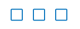
Demo
Installation
Install with NPM: npm install react-activity-indicator
Import in (es6):
import ActivityIndicator from 'react-activity-indicator'
The CSS file:
E.g. import in default using webpack:
import 'react-activity-indicator/src/activityindicator.css'Usage
The component accepts these props.
number: the number of activity indicatorsdefault: 3diameter: size of the loading indicatorsdefault: 20pxduration: color transition durationdefault: 400(ms)color: color of the inactive loading indicator.default: transparentactiveColor: color of the active loading indicator.default: blackborderRadius: border radius of the loading indicators.default: 10%borderWidth: border width of the loading indicators.default: 1pxborderColor: border color of the loading indicators.default: black
<ActivityIndicator = = = = ="#66D9EF" ="white" = ="50%" />Example
{ thisstate = loaded: false counter:0 thisinterval = } { if !thisstateloaded return <div => Loading thisstatecounter / 5000 elements <ActivityIndicator = = ="#0070bf" = ="50%" = /> </div> else return <div => <h3>Loaded!</h3> </div> } ReactDOM; Contributing
- Fork it!
- Create your feature branch:
git checkout -b my-new-feature - Commit your changes:
git commit -am 'Add some feature' - Push to the branch:
git push origin my-new-feature - Submit a pull request :D
History
- Submitted to GitHub & NPM
Credits
Alex Dunmow
License
MIT license. Feel free to do whatever you want, but we have no liability or obligation for support.