
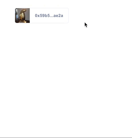
Profile Hover
profile-hover is a drop-in component that displays profile metadata for any ethereum address. Available in React and HTML/CSS versions.
Component Overview
The Profile Hover consists of two components: the Tile, which is displayed on the page, and the Hover, which is displayed when the Tile is hovered. Profile Hover is available for React and HTML/CSS apps.
Getting Started
React Component
Installation:
npm i -S profile-hoverUsage:
import ProfileHover from 'profile-hover'; const MyComponent = <ProfileHover = />;HTML Element
First add the script at the end of your page.
Then add the following tag where ever you display an address.
Additional Options:
Add data-display='full' to show the entire address instead of the shorten display.
Add data-theme='none' to not use any of our address bar styling. Allows you to wrap any existing elements in an address hover.
... your own html and styling How to Customize
Here are the ways you can customize the profile hover to better suit your app's needs.
Prop Types
| Property | Type | Default | Component | Description |
|---|---|---|---|---|
address |
String | Address property value is required to work. Provide an Ethereum address to this property to fetch profile information. |
||
showName |
Boolean | False | Tile | Provide property showName to show the user's name from their 3Box profile instead of their Ethereum address. |
url |
String | Tile | Provide property url with url string to set where clicking on the Tile will redirect the user. |
|
displayFull |
Boolean | False | Tile | Add displayFull property to show the entire address instead of the shortened display. |
tileStyle |
Boolean | False | Tile | Add tileStyle property to render the tile component as a tile. |
noTheme |
Boolean | False | Tile | Add noTheme property to not use any of our Tile styling. Allows you to wrap any existing elements in a Hover component. |
noImgs |
Boolean | False | Hover | Add noImgs property to prevent displaying of profile image and cover image in the Hover. |
noProfileImg |
Boolean | False | Hover | Add noProfileImg property to prevent displaying of just the profile image in the Hover. |
noCoverImg |
Boolean | False | Hover | Add noCoverImg property to prevent displaying of just the cover image in the Hover. |
orientation |
String | 'right' |
Hover | Provide property orientation with string 'top', 'bottom', 'right' or 'left' to set which way the Hover will pop up from the Tile. |
Prop Types example
<ProfileHover = ="bottom" ="https://3box.io/"/><ProfileHover = > ... your own html and styling</ProfileHover>Differences Between Desktop and Mobile
Given the current state of Web3 mobile dapp browsers and their lack of browser tab support, the behavior of the profile-hover React component has minor differences depending on device context. On desktop web and web2 mobile browsers, out-bound links within the hover element work as usual and open a new tab. However on Web3 mobile dapp browsers, since tabs do not exist, clicking on a link within the hover component will, instead, copy that URL to a users clipboard.