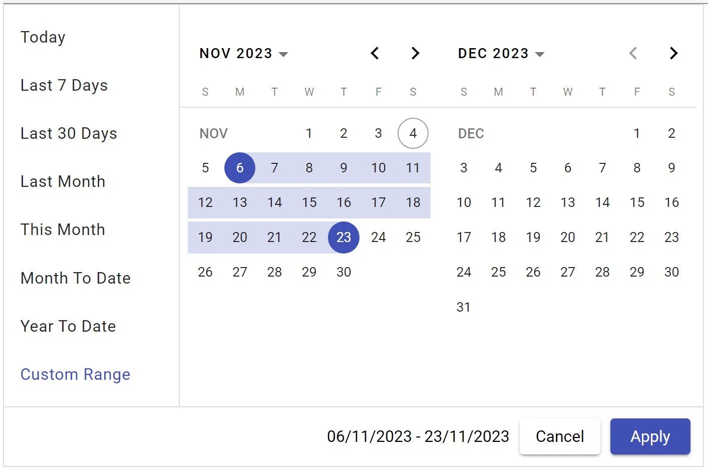
This library is build on top of angular material date-picker to provide date range selection with two views and predefined date options.
The following section explains the steps required to create a simple 2 view Date Range Picker component and demonstrates its basic usage.
To use the 2 view Date Range Picker component in your application, install the following dependency packages:
1. angular (version 17.x)
2. angular-material (version 17.x)
Angular provides an easy way to set up Angular CLI projects using the Angular CLI tool.
- Install the CLI application globally:
npm install -g @angular/cli- Create a new application:
ng new ng-date-range-picker-app- Navigate to the created project folder:
cd ng-date-range-picker-appTo use the 2 view Date Range Picker component in your application, install the following dependency packages:
- Angular Material Lib:
npm i @angular/material@17- Add bootstrap css inside angular.json:
"styles": [
        "src/styles.css",
        "@angular/material/prebuilt-themes/indigo-pink.css"
],Range Picker package can be installed using the following command:
npm i ng-material-date-range-pickerImport the 2 view Date Range Picker module into your Angular application (src/app/app.module.ts):
import { NgModule } from '@angular/core';
import { CommonModule } from '@angular/common';
import { BrowserModule } from '@angular/platform-browser';
import { NgDatePickerModule } from 'ng-material-date-range-picker';
import { AppComponent } from './app.component';

@NgModule({
  declarations: [AppComponent],
  imports: [BrowserModule, NgDatePickerModule,  CommonModule],
  bootstrap: [AppComponent]
})
export class AppModule { }Modify the template in src/app/app.component.ts to render the 2 view Date Range Picker component:
import { Component } from '@angular/core';
@Component({
  selector: 'app-root',
  template: `<ng-date-range-picker></ng-date-range-picker>`
})
export class AppComponent {
  title = 'ng-date-range-picker-test';
}After completing the required configuration, run the following command:
ng serveThis will display the Date Range Picker in your default browser.
- Allow to select date range with two views.
- Predefined date support with list items.
- User can modify predefined date list.
- Provides complete controls on predefined date action items.
| Name | Type | Description |
|---|---|---|
selectedDates |
DateRange<Date> |
optional. default selection of start and end date |
dateFormat |
string |
optional. default is 'dd/MM/yyyy' |
dateDropDownOptions |
ISelectDateOption[] |
optional. Addition options to predefined date action list. |
minDate |
Date |
optional. To specify minimum date default is current date -10 years. |
maxDate |
Date |
optional. To specify max date default is current date +10 years. |
selectedOptionIndex |
number |
optional. To default selected option. (by default it is 3 which is last 30 days.) |
| Name | Type | Description |
|---|---|---|
onDateSelectionChanged |
DateRange<Date> |
Emits when date selection is changed. And it contains range: DateRange and selectedOption: ISelectDateOption |
dateListOptions |
ISelectDateOption[] |
Emits pre-defined date action list items for configuration purpose. |
import { Component } from '@angular/core';
import { ISelectDateOption } from 'ng-date-range-picker/lib/model/select-date-option';

@Component({
  selector: 'app-root',
  template:` <ng-date-range-picker (dateListOptions)="dateListOptions($event)"></ng-date-range-picker>`
  templateUrl: './app.component.html',
  styleUrls: ['./app.component.scss'],
})
export class AppComponent {
  title = 'ng-date-range-picker-test';

  dateListOptions(optionList: ISelectDateOption[]) {
    optionList[0].isSelected = true;
    optionList[1].isVisible = false;
  }
}
In Above example first item of action list is selected and second option is hidden.

