This library provides a few UI components to help you to create a documentation website.
- Install angular-documentation-ui@latest
# For npm 7+, you need to add --legacy-peer-deps

npm i angular-documentation-ui@latest
- Install the @fortawesome/angular-fontawesome, ngx-highlightjs according to the compatibility table
# For npm 7+, you need to add --legacy-peer-deps

npm install @fortawesome/angular-fontawesome @fortawesome/fontawesome-svg-core @fortawesome/free-solid-svg-icons ngx-highlightjs
- This library supports Angular 12.x, 13.x, 14.x, 15.x
| Angular |
angular-documentation-ui |
ngx-highlightjs |
@fortawesome/angular-fontawesome |
@fortawesome/fontawesome-svg-core |
@fortawesome/free-solid-svg-icons |
| 12.x |
0.9.x |
^6.1.3 |
^0.9.0 |
^1.2.35 |
^5.15.3 |
| 13.x |
0.9.x |
^6.1.3 |
^0.9.0 |
^1.2.35 |
^5.15.3 |
| 14.x |
0.9.x |
^7.0.1 |
^0.10.0 |
^1.2.36 |
^5.15.4 |
| 15.x |
0.9.x |
^7.0.1 |
^0.10.0 |
^1.2.36 |
^5.15.4 |
| 16.x |
0.9.x |
^10.0.0 |
^0.14.1 |
^6.5.1 |
^6.5.1 |
| 17.x |
0.9.x |
^10.0.0 |
^0.14.1 |
^6.5.1 |
^6.5.1 |
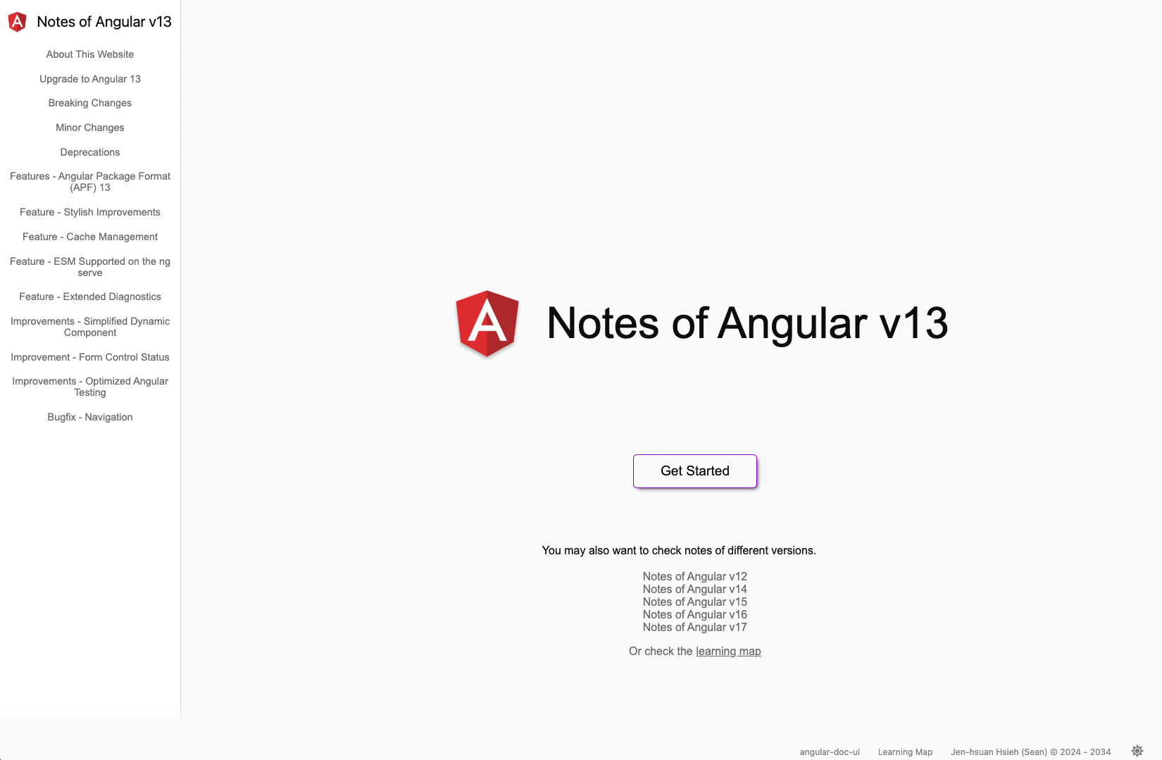
To get up and running using Angular documentation UI with Angular follow the below steps:
For module-based applications
- Import this module to add.module.ts
import { DocumentationUiModule } from 'angular-documentation-ui';

@NgModule({
  declarations: [
    AppComponent,
    ...
  ],
  imports: [
    ...,
    DocumentationUiModule
  ],
  providers: [
    ...
  ],
  bootstrap: [AppComponent]
})
export class AppModule { }
- Import the scss file to src/styles.scss
@import "../node_modules/angular-documentation-ui/styles/theme/index";
@import "../node_modules/angular-documentation-ui/styles/pages/index";
@import "../node_modules/angular-documentation-ui/styles/code/index";

body {
  background: var(--background-default);
}
For component-based applications
- Import this module to main.ts
import { DocumentationUiModule } from 'angular-documentation-ui';

bootstrapApplication(AppComponent, {
  providers: [
    importProvidersFrom(DocumentationUiModule)
    ],
});
- Import the scss file to src/styles.scss
@import "../node_modules/angular-documentation-ui/styles/theme/index";
@import "../node_modules/angular-documentation-ui/styles/pages/index";
@import "../node_modules/angular-documentation-ui/styles/code/index";
body {
background: var(--background-default);
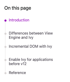
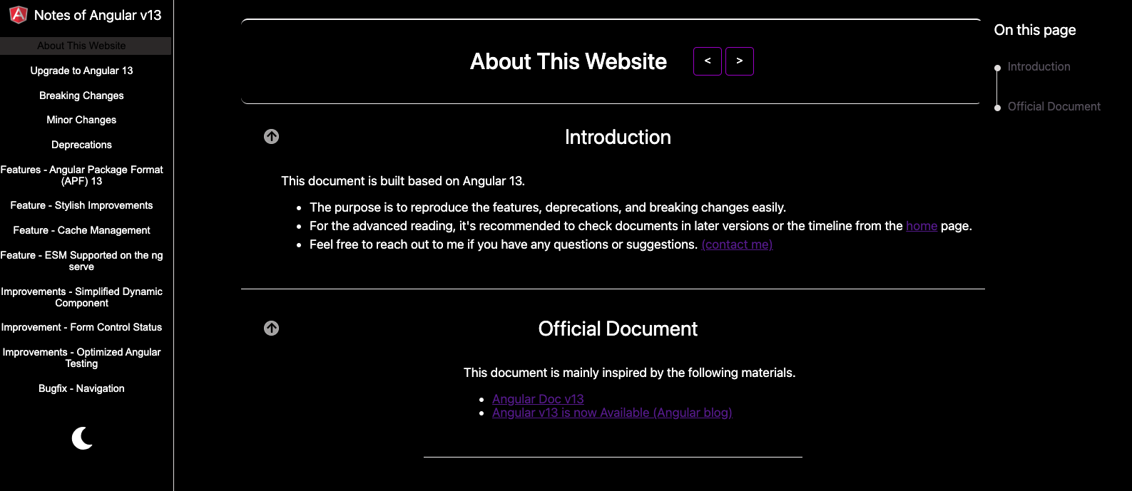
}This component allows us to create the timeline to indicate the current section with the highlighted color.
- The following screnshot shows the demo of this component.
| Name |
Type |
Description |
| [titles] |
string[] |
Item names on the list |
| [sections] |
QueryList
|
Instances of sections |
| [getIdFromTitle] |
function |
The function to create ID for title |
| [marginBotton] |
number |
The margin of the bottom (optional) |
- Retrieve section elements and define section titles in your component
import { getIdFromTitle } from 'angular-documentation-ui';

export class MyComponent {
  getIdFromTitle = getIdFromTitle;

  sectionTitles = [
    "1",
    "2"
  ];

  @ViewChildren("section", {read: ElementRef}) sections: QueryList<ElementRef> | undefined;
}
- Update your template
<app-doc-reviewer-container
  [sections]="sections"
  [titles]="sectionTitles"
  [getIdFromTitle]="getIdFromTitle">
</app-doc-reviewer-container>

<div #section>
  <div class="title" [id]="getIdFromTitle(sectionTitles[0])" title>{{ sectionTitles[0] }}
  </div>
</div>

<div #section>
  <div class="title" [id]="getIdFromTitle(sectionTitles[1])" title>{{ sectionTitles[1] }}
  </div>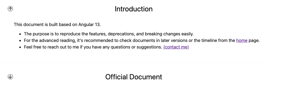
</div>This component allows us to fold and unfold the content.
- The following screnshot shows the demo of this component.
None.
- Update in your component
import { getIdFromTitle } from 'angular-documentation-ui';

export class MyComponent {
  getIdFromTitle = getIdFromTitle;
}
- Update your template
<app-section-container>
  <div class="title" [id]="getIdFromTitle(sectionTitles[0])" title>{{ sectionTitles[0] }}</div>
  <div class="description-container">
    <div class="item">
      content
    </div>
  </div>
</app-section-container>
3. Theme and Theme service
This component allows us to switch the theme for the UI component from this library.
- The following screnshot shows the demo of this component.
None.
- Inject the Thene service to the App component
import { ThemeService } from 'angular-documentation-ui';

@Component({
  selector: 'app-root',
  templateUrl: './app.component.html',
  styleUrls: ['./app.component.scss']
})
export class AppComponent {
  constructor(private themeService: ThemeService) {
    let themeType = this.themeService.getCurrentThemeType();
    this.themeService.setThemeByThemeType(themeType);
  }
}
- Add the theme switcher to the template
<div class="theme-container">
  <app-theme></app-theme>
</div>
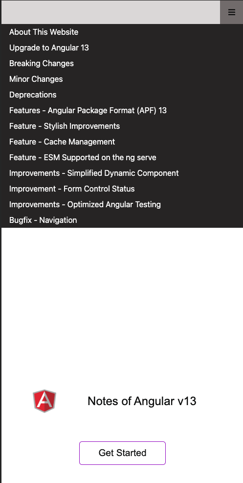
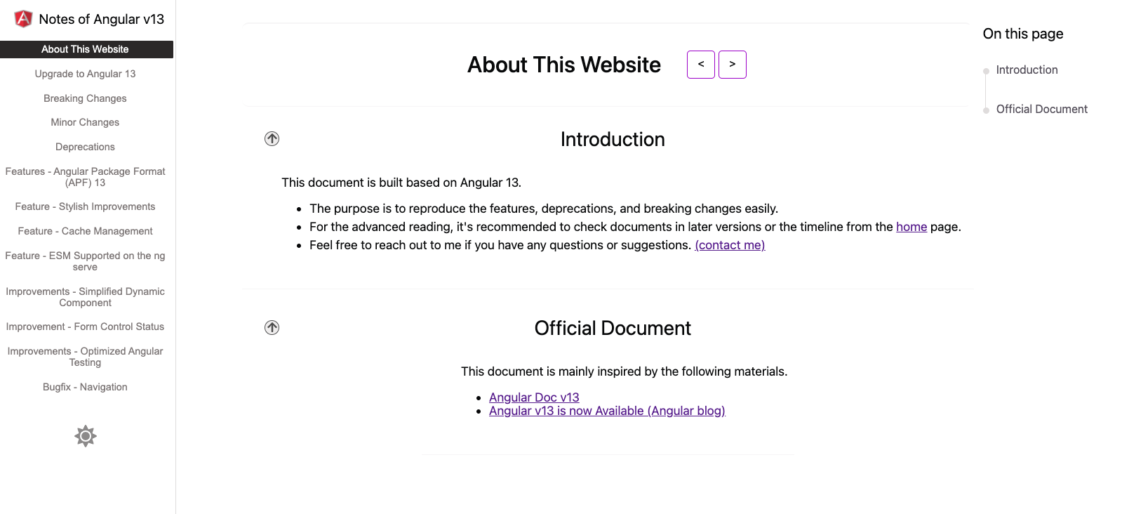
This component allows us to navigate to the next page or the last page of the self-defined orders.
- The following screnshot shows the demo of this component.
| Name |
Type |
Description |
| [routeMap] |
map<string, string> |
The map to store pairs of URLs and string |
| [sideBarList] |
string[] |
Unique string for each route |
- Define routeMap and sideBarList in your component
export const sideBarList = [
  RouteType.DOCUMENTS,
  RouteType.MIGRATIONS,
  RouteType.BREAKING_CHANGE,
];

export const RouteMap = new Map<string, RouteType>([
  ['/documents', RouteType.DOCUMENTS],
  ['/migrations', RouteType.MIGRATIONS],
  ['/breaking-changes', RouteType.BREAKING_CHANGE],
]);

export const sideBarList = [
  RouteType.DOCUMENTS,
  RouteType.MIGRATIONS,
  RouteType.BREAKING_CHANGE,
];

@Component({
  selector: 'app-root',
  templateUrl: './app.component.html',
  styleUrls: ['./app.component.scss']
})
export class AppComponent {
  sideBarList = sideBarList;
  routeMap = RouteMap;
}
- Add the theme switcher to the template
<app-navigation-button-container
  [routeMap]="routeMap"
  [sideBarList]="sideBarList">
</app-navigation-button-container>
5. Footer
- The following screnshot shows the demo of this component.
| Name |
Type |
Description |
| [routeMap] |
map<string, string> |
The map to store pairs of URLs and string |
| [sideBarList] |
string[] |
Unique string for each route |
| [showNavigationButton] |
boolean |
Show the navigation buttons or not |
| [externalLinkMap] |
map<string, string> |
The map to store pairs of titles and URLs |
- Define routeMap and sideBarList in your component
export const sideBarList = [
  RouteType.DOCUMENTS,
  RouteType.MIGRATIONS,
  RouteType.BREAKING_CHANGE,
];

export const RouteMap = new Map<string, RouteType>([
  ['/documents', RouteType.DOCUMENTS],
  ['/migrations', RouteType.MIGRATIONS],
  ['/breaking-changes', RouteType.BREAKING_CHANGE],
]);

export const sideBarList = [
  RouteType.DOCUMENTS,
  RouteType.MIGRATIONS,
  RouteType.BREAKING_CHANGE,
];

@Component({
  selector: 'app-root',
  templateUrl: './app.component.html',
  styleUrls: ['./app.component.scss']
})
export class AppComponent {
  sideBarList = sideBarList;
  routeMap = RouteMap;

  linkMap = new Map<string, string>([
    ["angular-doc-ui", "https://www.npmjs.com/package/angular-documentation-ui?activeTab=readme"]
  ]);
}
- Add the footer to the template
<app-footer-container
  [routeMap]="routeMap"
  [sideBarList]="sideBarList"
  [showNavigationButton]="false"
  [externalLinkMap]="linkMap">
</app-footer-container>
- The following screnshot shows the demo of this component.
| Name |
Type |
Description |
| [tooltipsTemplate] |
TemplateRef
|
null |
| [tooltipsWindowHeight] |
number |
The height of the tooltips window |
| [tooltipsWindowWidth] |
number |
The width of the tooltips window |
- Define the content of the tooltips in your component
<ng-template #tooltipsContent>
  your content
</ng-template>
- Use the help-icon in the template
<app-help-icon
  [tooltipsTemplate]="tooltipsContent"
  [tooltipsWindowWidth]="180"
  [tooltipsWindowHeight]="180">
 </app-help-icon>
6. Navigation Button for Mobile
- The following screnshot shows the demo of this component.
| Name |
Type |
Description |
| [routeMap] |
map<string, string> |
The map to store pairs of URLs and string |
| [sideBarList] |
string[] |
Unique string for each route |
| [typeTitleMap] |
map<string, string> |
The map to store pairs of types and titles |
- Define routeMap typeTitleMap, and sideBarList in your component
export enum RouteType {
  BREAKING_CHANGE = 'BREAKING_CHANGE',
  DOCUMENTS = 'DOCUMENTS',
  MIGRATIONS = 'MIGRATIONS',
}

export const RouteMap = new Map<string, RouteType>([
  ['/documents', RouteType.DOCUMENTS],
  ['/migrations', RouteType.MIGRATIONS],
  ['/breaking-changes', RouteType.BREAKING_CHANGE],
]);

export const TypeTitleMap = new Map<RouteType, string>([
  [RouteType.DOCUMENTS, 'About This Website'],
  [RouteType.MIGRATIONS, 'Upgrade to Angular 13'],
  [RouteType.BREAKING_CHANGE, 'Breaking Changes'],
  ]);

export const sideBarList = [
  RouteType.DOCUMENTS,
  RouteType.MIGRATIONS,
  RouteType.BREAKING_CHANGE,
];

@Component({
  selector: 'app-root',
  templateUrl: './app.component.html',
  styleUrls: ['./app.component.scss']
})
export class AppComponent {
  sideBarList = sideBarList;
  routeMap = RouteMap;
}
- Add the nav-container to the template
<app-mobile-nav-container
  [routeMap]="routeMap"
  [sideBarList]="sideBarList"
  [typeTitleMap]="typeTitleMap">
</app-mobile-nav-container>
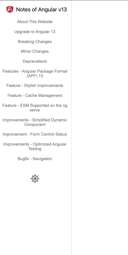
- The following screnshot shows the demo of this component.
| Name |
Type |
Description |
| [key] |
string |
The key of the code snippet |
| [codeMap] |
map<string, Code> |
The map to store pairs of keys and code snippets |
- Define the codeMap in your component
import { getIdFromTitle } from 'angular-documentation-ui';
import { Code, CodeLanguageType } from "angular-documentation-ui";

export class MyComponent {
  codeMap = new Map<string, Code>([
    ["instruction", {
      code: `
npx @angular/cli@13 new Angular13Project
      `,
      languages:[CodeLanguageType.html]
    }]
  ])
}
- Add the app-code-container to the template
<app-code-container key="instruction" [codeMap]="codeMap">
</app-code-container>
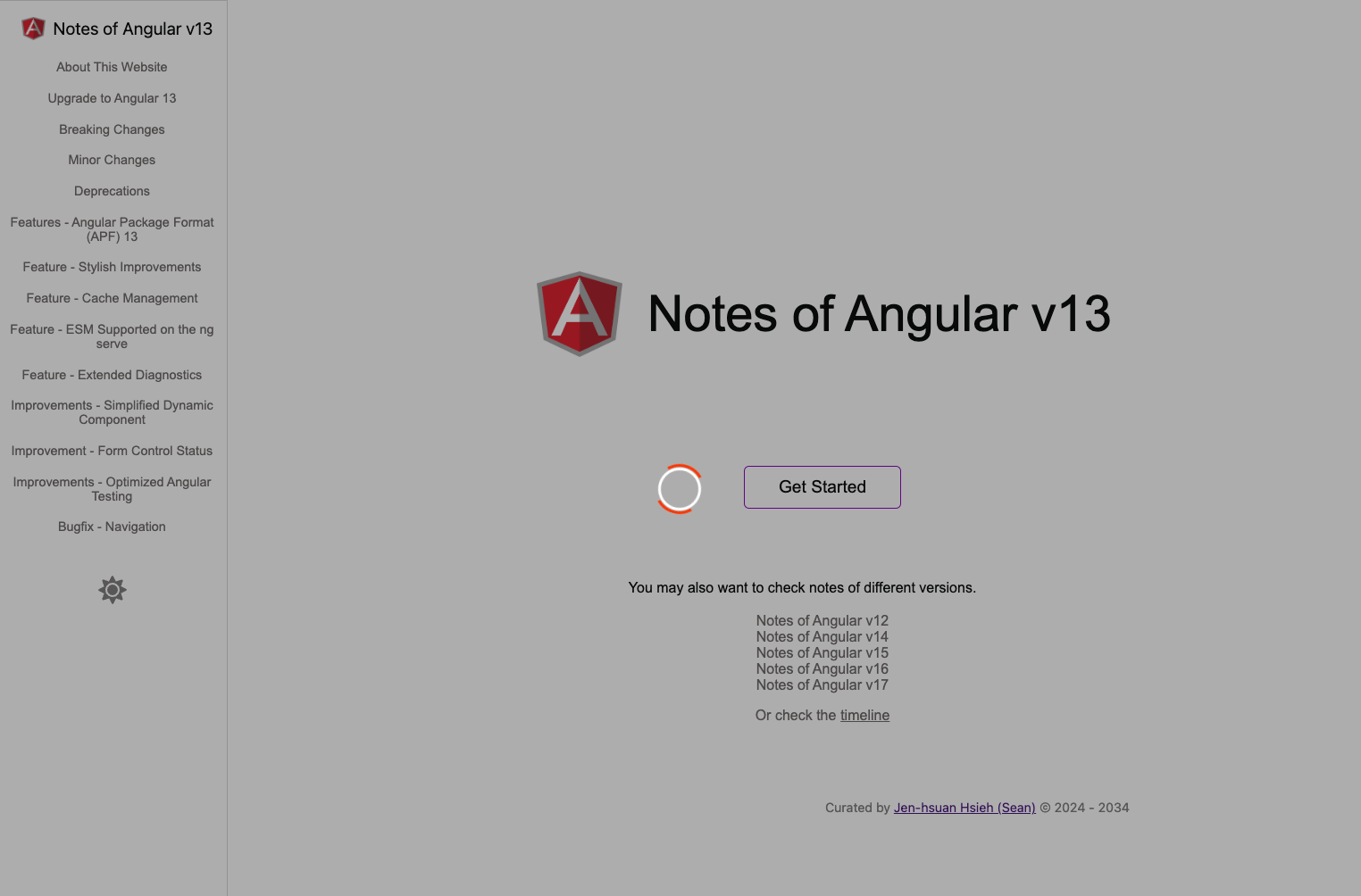
- The following screnshot shows the demo of this component.
| Name |
Type |
Description |
| [routeMap] |
map<string, string> |
The map to store pairs of URLs and string |
| [sideBarList] |
string[] |
Unique string for each route |
| [typeTitleMap] |
map<string, string> |
The map to store pairs of types and titles |
| [selectedRoute] |
string |
The default selected route |
| [showThemeButton] |
boolean |
Show the theme buttons or not |
| [showArrowButton] |
boolean |
Show the arrow buttons or not |
- Define routeMap, TypeTitleMapand sideBarList in your component
export enum RouteType {
  BREAKING_CHANGE = 'BREAKING_CHANGE',
  DOCUMENTS = 'DOCUMENTS',
  MIGRATIONS = 'MIGRATIONS',
}

export const RouteMap = new Map<string, RouteType>([
  ['/documents', RouteType.DOCUMENTS],
  ['/migrations', RouteType.MIGRATIONS],
  ['/breaking-changes', RouteType.BREAKING_CHANGE],
]);

export const sideBarList = [
  RouteType.DOCUMENTS,
  RouteType.MIGRATIONS,
  RouteType.BREAKING_CHANGE,
];

export const TypeTitleMap = new Map<RouteType, string>([
  [RouteType.DOCUMENTS, 'About This Website'],
  [RouteType.MIGRATIONS, 'Upgrade to Angular 13'],
  [RouteType.BREAKING_CHANGE, 'Breaking Changes'],
  ]);

@Component({
  selector: 'app-root',
  templateUrl: './app.component.html',
  styleUrls: ['./app.component.scss']
})
export class AppComponent {
  sideBarList = sideBarList;
  routeMap = RouteMap;
  typeTitleMap = TypeTitleMap;
}
- Add the app-side-bar-container to the template
<app-side-bar-container
  [routeMap]="routeMap"
  [sideBarList]="sideBarList"
  [typeTitleMap]="typeTitleMap"
  selectedRoute="DOCUMENTS">
  {{ customized content}}
</app-side-bar-container>
9. Navigation Button for Universal
- It's the componnt combined app-side-bar-container and the app-mobile-nav-container
| Name |
Type |
Description |
| [routeMap] |
map<string, string> |
The map to store pairs of URLs and string |
| [sideBarList] |
string[] |
Unique string for each route |
| [typeTitleMap] |
map<string, string> |
The map to store pairs of types and titles |
| [selectedRoute] |
string |
The default selected route |
| [showThemeButtonForSideBar] |
boolean |
Show the theme buttons or not |
| [showArrowButtonForSideBar] |
boolean |
Show the arrow buttons or not |
- Define routeMap, TypeTitleMapand sideBarList in your component
export enum RouteType {
  BREAKING_CHANGE = 'BREAKING_CHANGE',
  DOCUMENTS = 'DOCUMENTS',
  MIGRATIONS = 'MIGRATIONS',
}

export const RouteMap = new Map<string, RouteType>([
  ['/documents', RouteType.DOCUMENTS],
  ['/migrations', RouteType.MIGRATIONS],
  ['/breaking-changes', RouteType.BREAKING_CHANGE],
]);

export const sideBarList = [
  RouteType.DOCUMENTS,
  RouteType.MIGRATIONS,
  RouteType.BREAKING_CHANGE,
];

export const TypeTitleMap = new Map<RouteType, string>([
  [RouteType.DOCUMENTS, 'About This Website'],
  [RouteType.MIGRATIONS, 'Upgrade to Angular 13'],
  [RouteType.BREAKING_CHANGE, 'Breaking Changes'],
  ]);

@Component({
  selector: 'app-root',
  templateUrl: './app.component.html',
  styleUrls: ['./app.component.scss']
})
export class AppComponent {
  sideBarList = sideBarList;
  routeMap = RouteMap;
  typeTitleMap = TypeTitleMap;
}
- Add the app-side-bar-container to the template
<lib-doc-nav-container
  [routeMap]="routeMap"
  [sideBarList]="sideBarList"
  [typeTitleMap]="typeTitleMap"
  selectedRoute="DOCUMENTS">
  {{ customized content}}
</lib-doc-nav-container>
- The following screnshot shows the demo of this component.
| Name |
Type |
Description |
| [detectNavigation] |
boolean |
Detect the changes of navigation or not |
<router-outlet></router-outlet>
<app-loading-indicator [detectNavigation]="true"></app-loading-indicator>
- The following screnshot shows the demo of this component.
| Name |
Type |
Description |
| [root] |
AngularUiDocumentationTree
|
Tree structure of the raw data |
| [searchValueSubject] |
BehaviorSubject
|
BehaviorSubject for the search keyword |
| [isLoading] |
boolean (optional) |
To show the loading indicator or not |
| [indentLength] |
number (optional) |
The indent length |
| [indentPaddingLeft] |
number (optional) |
Tree left padding length |
- Update the template
<app-angular-ui-documentation-tree
  [root]="root"
  [searchValueSubject]="searchValueSubject"
  [isLoading]="isLoading">
</app-angular-ui-documentation-tree>
- Define the HTTP clients
@Injectable({
  providedIn: 'root'
})
export class AngularSiteService {

  constructor(protected http: HttpClient) { }

  list(): Observable<AngularSite[]> {
    return this.http.get<AngularSite[]>('api/angular-site');
  }
}

@Injectable({
  providedIn: 'root'
})
export class AngularSiteTopicService {
  constructor(protected http: HttpClient) { }

  load(siteId: string): Observable<AngularSiteTopic[]> {
    return this.http.get<AngularSiteTopic[]>(`api/angular-site-topic?siteId=${siteId}`);
  }
}export class AngularSite {
id: string;
name: string;
url: string;
}
export class AngularSiteTopic {
id: string;
siteId: string;
name: string;
url: string;
}
export type HelpIconContentTreeRawaDataType = AngularSite | AngularSiteTopic;
- Update the component
export class AppComponent {
  root:  AngularUiDocumentationTree<HelpIconContentTreeRawaDataType> | null;
  isLoading: boolean = false;
  searchValueSubject = new BehaviorSubject<string | null>(null);

  depthApiLoadMap = new Map<number, (id?: string) => Observable<HelpIconContentTreeRawaDataType[]>>([
    [0, this.angularSiteService.list.bind(this.angularSiteService)],
    [1, (id) => this.angularSiteTopicService.load(id!)],
  ]);

  constructor(
    protected angularSiteService: AngularSiteService,
    protected angularSiteTopicService: AngularSiteTopicService,
    private angularUiDocumentationTreeService: AngularUiDocumentationTreeService<HelpIconContentTreeRawaDataType>
  ) {
    this.service.sideBarContainer$.subscribe(type => {
      this.currentSideBarContainerType = type;
    });

    this.isLoading = true;
    this.angularUiDocumentationTreeService.buildTree(
      "All Topics",
      this.depthApiLoadMap
    ).subscribe((data: AngularUiDocumentationTree<HelpIconContentTreeRawaDataType>) => {
      this.root = data;
      this.isLoading =false;
    })
  }
}
- Update the app.compnent.ts
export class AppComponent implements OnInit {
  ngOnInit(): void {
    updateGoogleAnalyticsId({{ your Google Analytics ID}});
  }
}

