
Salesforce Lightning Design System (SLDS) UI Kit
The SLDS UI Kit is a collection of Sketch Libraries of Lightning Design System components and design patterns. The thousands of customers and partners who build applications on the Salesforce platform can use these resources to quickly visualize and test designs before they're implemented in their Salesforce organizations.
Install and always stay up to date by subscribing to the Sketch Library links below.
» Copy/paste the URLs below in any browser address bar «
-
Component Library
sketch://add-library?url=https://www.lightningdesignsystem.com/sketch-library-rss.xml -
Builder Patterns (optional)
sketch://add-library?url=https://www.lightningdesignsystem.com/sketch-library-builder-rss.xml -
Chart Patterns (optional)
sketch://add-library?url=https://www.lightningdesignsystem.com/sketch-library-chart-rss.xml -
Rules, Filters, and Logic Patterns (optional)
sketch://add-library?url=https://www.lightningdesignsystem.com/sketch-library-rfl-rss.xml -
User Engagement Patterns (optional)
sketch://add-library?url=https://www.lightningdesignsystem.com/sketch-library-user-engagement-rss.xml
or download and install these files manually
Requirements
Sketch
Download the most recent version of Sketch.
These files are optimized for Sketch but if you don't have it you can use a free application with less functionality called Figma instead
Salesforce Sans fonts
- Download the Salesforce Sans fonts from the Design System repository
- Install the Salesforce Sans fonts on your system
Getting Started
Welcome to the Summer '19 Salesforce Lightning Design System (SLDS) Sketch UI Kit
The Salesforce UX team has made optimizations with this Sketch Library so you can more efficiently create Salesforce Lightning interfaces. In the instructions below, we’ll cover the basics and some tips for you to get started. You can still use this SLDS Component Library Sketch UI Kit just like you have in previous releases, by downloading it, but the Salesforce UX team believes these files are best used as a Sketch Library.
Sketch Libraries allow you to have SLDS components and patterns available from Sketch’s symbols menu in any file you open. Sketch Libraries will automatically update your designs when the library is updated. Your designs will never be out of date if they’re linked to this Sketch Library document.
How to use the SLDS Sketch UI Kits as Sketch Libraries
Copy and paste the following links, one by one, in any browser. This will subscribe your Sketch application to automatically download and install new versions of the SLDS Sketch UI Kits.
- Component Library
sketch://add-library?url=https://www.lightningdesignsystem.com/sketch-library-rss.xml
- Builder Patterns (optional)
sketch://add-library?url=https://www.lightningdesignsystem.com/sketch-library-builder-rss.xml
- Chart Patterns (optional)
sketch://add-library?url=https://www.lightningdesignsystem.com/sketch-library-chart-rss.xml
- Rules, Filters, and Logic Patterns (optional)
sketch://add-library?url=https://www.lightningdesignsystem.com/sketch-library-rfl-rss.xml
- User Engagement Patterns (optional)
sketch://add-library?url=https://www.lightningdesignsystem.com/sketch-library-user-engagement-rss.xml
Alternatively, download the Sketch Libraries in this repository you'd like to install. Open Sketch > Preferences > Libraries and click Add Library.... Select the library you'd like to install.
Verify that you've successfully installed the Sketch Libraries by opening Sketch > Preferences > Libraries. You should see all of the libraries you installed above.

That's it! Now you can supercharge your designs for the Salesforce platform.
How to Structure your Sketch project
The SLDS UI Kit is optimized to mimic the code structure of a design system but within the bounds of Sketch. The main resource is the SLDS Component Library. This file is a replica of SLDS components and tokens. Also in the kit are multiple pattern files. These files inherit symbols from the SLDS Component Library then are composed to create examples for each pattern. If you're designing for Lightning, you'll always need the SLDS Component Library file. Depending on the patterns you're designing, you may need one or all of the pattern files.
To structure your Sketch project, create a file for your designs. Make sure that your Sketch application has the SLDS UI Kit libraries installed. Use the SLDS website as a reference as you decide which components to use. When you know which you'll need, insert the appropriate symbol into your Sketch file. Try not to detach symbols whenever possible. If you do, you are then out of sync when the next SLDS UI Kit updates are released.
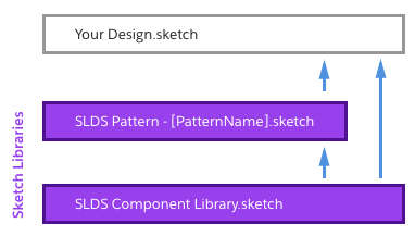
SLDS Component Library -> Base Library with SLDS components used in all SLDS Sketch documents
SLDS Pattern - Builder -> Extends SLDS Component Library and composes components for Salesforce builder patterns
SLDS Pattern - Chart -> Extends SLDS Component Library and composes components for charts patterns
SLDS Pattern - Rules, Filters, and Logic -> Extends SLDS Component Library and composes components for rules, filters, and logic patterns
SLDS Pattern - User Engagement -> Extends SLDS Component Library and composes components for user engagement patterns
Learn More
Artboard Navigation
In the primary SLDS Component Library Sketch file, all components have their own artboards. Finding the component symbol you want to use a breeze since the lightningdesignsystem.com website menu is mapped to the Sketch artboard list.


Nested Symbols
Sketch symbols allow you to use and reuse a self-contained design element across a Sketch document. Any changes made to a symbol will update across your whole document. It’s really handy! Nested symbols allow for even more customization, without breaking the symbol from its source, by adding symbols inside other symbols. These nested symbols are used throughout the Sketch file so that you can customize designs as much as possible without detaching the symbol.


Tokens as Layer and Typography Styles
Salesforce Lightning Design System uses tokens to store visual design attributes. The SLDS Component Library uses Sketch Layer Styles and Sketch Text Styles to mimic Lightning Design System design tokens. This allows Sketch designs to use the equivalent of a design token; saving you time spec'ing your designs for development.
In symbols that contain solid color backgrounds, like icons, you’ll find the background is a layer style. This allows us to easily make file-wide changes to colors when new visual styles are introduced in SLDS. Instead of changing fill colors individually in hundreds of shapes in this document, we can just update a color symbol or point the shape to another color symbol.
How to use Icon Symbols
Across Salesforce, you'll frequently see Lightning Design System icons. We’ve constructed them to be easily used individually and as nested symbols. The steps below cover how to place icon symbols individually by using the SLDS Component Library as a Sketch Library
- Choose an icon type. SLDS has four types of icons. Utility icons are used for everything except Salesforce object icons. Utility icons are what you’ll want to use 95% of the time. Action icons are primarily used in mobile applications. Custom icons are to be used for custom Salesforce objects. Standard icons are used for standard Salesforce objects.
- Place your icon type symbol. Once you’ve chosen the type of icon you’d like to use (Utility, right?) place that symbol where you’d like in your Sketch document.
- Choose your icon glyph. In Sketch’s right overrides panel, choose the icon glyph you’d like to use from the dropdown menu.
- (Optional) Choose an icon glyph color. In Sketch’s right overrides panel, choose the icon glyph color you’d like to use from the dropdown menu.
- (Optional, for Action, Custom and Standard Icon Types) Choose an icon background color. In Sketch’s right overrides panel, choose the icon background color you’d like to use from the dropdown menu.
Contributing, Feature Requests and Bug Reporting
The SLDS team welcomes your help in maintaining the SLDS Component Library. Please add any bugs or feature requests under the Issues tab of this repository.
External contributions are currently closed
Throughout a release, Salesforce's design team contributes to these Sketch files through an application called Abstract. These releases are completed at least four months before being released to the public. Public contributions become unmanagable to merge since they are added to a version that is four months or more old.
License
All icons and images are licensed under Creative Commons Attribution-NoDerivatives 4.0
