
React Loading Button


A small react loading button component for getting flexibility to show other content instead of full screen loader while submitting API request.
React loading Button Playground
📝 Usage
Just install the package using command
npm install @girishsawant999/react-loading-button
And then import component in your react app
import Button from '@girishsawant999/react-loading-button';

// Use Button Component

<Button loading={isLoading}>Loading Button</Button>;
That's all and you are ready to go.
📃 Props
| Prop | Types | Description |
|---|---|---|
| loading | Boolean Default: false
|
Added loader in button when value is true
|
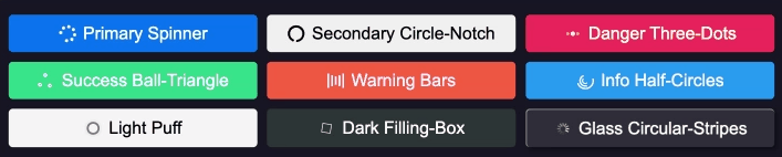
| buttonType |
primary, secondary, danger, success, warning, info, light, dark, glassDefault: primary
|
Set type of layout to button you can check it on playground |
| loader |
spinner, circle-notch, three-dots, ball-triangle, bars, filling-box, puff, half-circles, circular-stripesDefault: spinner
|
Set type of loader in button while loading |
Additionally you can pass any other props to button