
<mwc-top-app-bar> 

IMPORTANT: The Material Web Components are a work in progress and subject to major changes until 1.0 release.
Top App Bars are a container for items such as application title, navigation icon, and action items.
For a fixed position version of this component, see <mwc-top-app-bar-fixed>
Material Design Guidelines: App Bars: Top
Installation
npm install @dev.mohe/mwc-top-app-barNOTE: The Material Web Components are distributed as ES2017 JavaScript Modules, and use the Custom Elements API. They are compatible with all modern browsers including Chrome, Firefox, Safari, Edge, and IE11, but an additional tooling step is required to resolve bare module specifiers, as well as transpilation and polyfills for IE11. See here for detailed instructions.
Example Usage
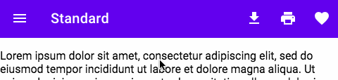
Standard
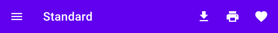
<mwc-top-app-bar>
    <mwc-icon-button icon="menu" slot="navigationIcon"></mwc-icon-button>
    <div slot="title">Title</div>
    <mwc-icon-button icon="file_download" slot="actionItems"></mwc-icon-button>
    <mwc-icon-button icon="print" slot="actionItems"></mwc-icon-button>
    <mwc-icon-button icon="favorite" slot="actionItems"></mwc-icon-button>
    <div><!-- content --></div>
</mwc-top-app-bar>
Center Title
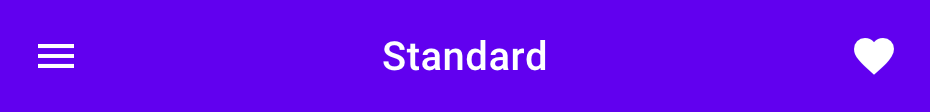
<mwc-top-app-bar centerTitle>
    <mwc-icon-button icon="menu" slot="navigationIcon"></mwc-icon-button>
    <div slot="title">Title</div>
    <mwc-icon-button icon="favorite" slot="actionItems"></mwc-icon-button>
    <div><!-- content --></div>
</mwc-top-app-bar>
Dense
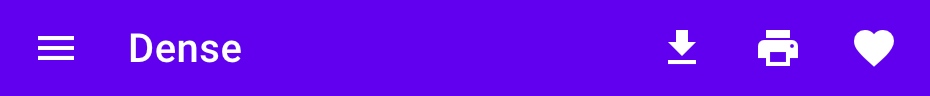
<mwc-top-app-bar dense>
    <mwc-icon-button icon="menu" slot="navigationIcon"></mwc-icon-button>
    <div slot="title">Title</div>
    <mwc-icon-button icon="file_download" slot="actionItems"></mwc-icon-button>
    <mwc-icon-button icon="print" slot="actionItems"></mwc-icon-button>
    <mwc-icon-button icon="favorite" slot="actionItems"></mwc-icon-button>
    <div><!-- content --></div>
</mwc-top-app-bar>
Prominent
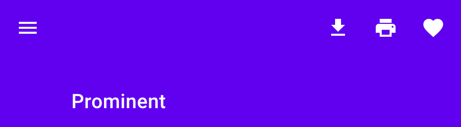
<mwc-top-app-bar prominent>
    <mwc-icon-button icon="menu" slot="navigationIcon"></mwc-icon-button>
    <div slot="title">Title</div>
    <mwc-icon-button icon="file_download" slot="actionItems"></mwc-icon-button>
    <mwc-icon-button icon="print" slot="actionItems"></mwc-icon-button>
    <mwc-icon-button icon="favorite" slot="actionItems"></mwc-icon-button>
    <div><!-- content --></div>
</mwc-top-app-bar>
Prominent and Dense
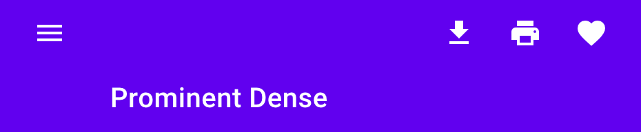
<mwc-top-app-bar prominent dense>
    <mwc-icon-button icon="menu" slot="navigationIcon"></mwc-icon-button>
    <div slot="title">Title</div>
    <mwc-icon-button icon="file_download" slot="actionItems"></mwc-icon-button>
    <mwc-icon-button icon="print" slot="actionItems"></mwc-icon-button>
    <mwc-icon-button icon="favorite" slot="actionItems"></mwc-icon-button>
    <div><!-- content --></div>
</mwc-top-app-bar>
Customize Colors
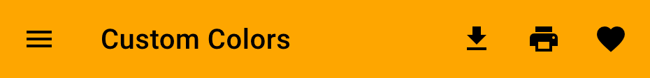
mwc-top-app-bar {
  --mdc-theme-primary: orange;
  --mdc-theme-on-primary: black;
}
API
Slots
| Name | Description |
|---|---|
actionItems |
A number of <mwc-icon-button> elements to use for action icons on the right side. |
navigationIcon |
One <mwc-icon-button> element to use for the left icon. |
title |
A <div> or <span> that will be used as the title text. |
| default | Scrollable content to display under the bar. This may be the entire application. |
Properties/Attributes
| Name | Type | Default | Description |
|---|---|---|---|
centerTitle |
boolean |
false |
Centers the title horizontally. Only meant to be used with 0 or 1 actionItems. |
dense |
boolean |
false |
Makes the bar a little smaller for higher density applications. |
prominent |
boolean |
false |
Makes the bar much taller, can be combined with dense. |
scrollTarget |
HTMLElement | Window
|
window |
Element used to listen for scroll events. |
Methods
None
Events
| Name | Detail | Description |
|---|---|---|
MDCTopAppBar:nav |
{} |
Fired when the navigationIcon is clicked. |
CSS Custom Properties
| Name | Default | Description |
|---|---|---|
--mdc-top-app-bar-width |
100% |
Width of the top-app-bar in relation to the Window. |
Global Custom Properties
| Name | Description |
|---|---|
--mdc-theme-primary |
Background color of the bar |
--mdc-theme-on-primary |
Text color of the title, and icon colors |
--mdc-typography-headline6-<PROPERTY> |
Styles the typography of the top-app-bar title. |