
<mwc-drawer> 

IMPORTANT: The Material Web Components are a work in progress and subject to major changes until 1.0 release.
The Navigation Drawer is used to organize access to destinations and other functionality on an app.
Material Design Guidelines: Navigation Drawer
Installation
npm install @dev.mohe/mwc-drawerNOTE: The Material Web Components are distributed as ES2017 JavaScript Modules, and use the Custom Elements API. They are compatible with all modern browsers including Chrome, Firefox, Safari, Edge, and IE11, but an additional tooling step is required to resolve bare module specifiers, as well as transpilation and polyfills for IE11. See here for detailed instructions.
Example usage
Standard
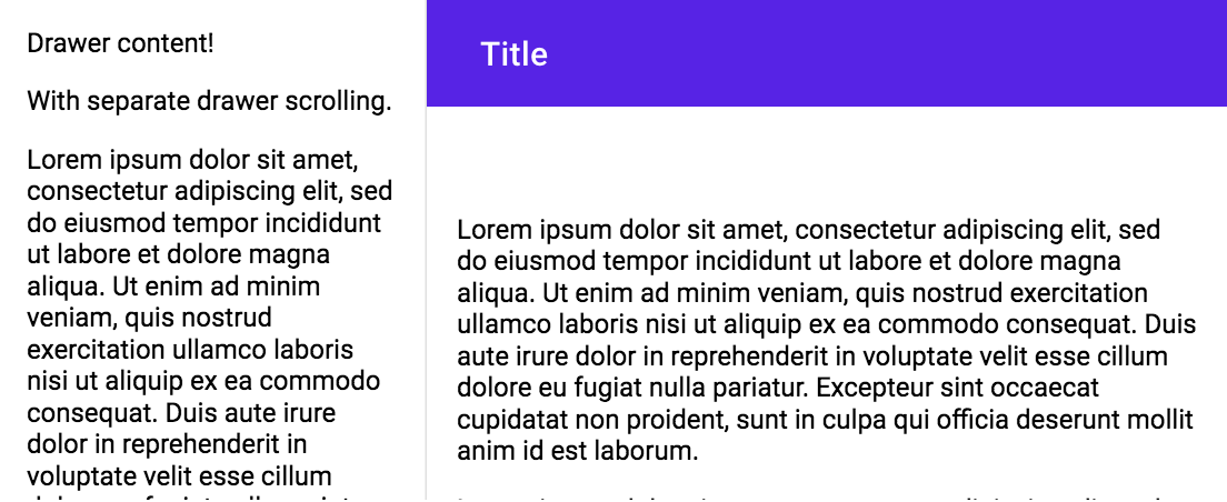
<mwc-drawer>
    <div>
        <p>Drawer Content!</p>
    </div>
    <div slot="appContent">
        <mwc-top-app-bar>
            <div slot="title">Title</div>
        </mwc-top-app-bar>
        <div>
            <p>Main Content!</p>
        </div>
    </div>
</mwc-drawer>
Standard with Header
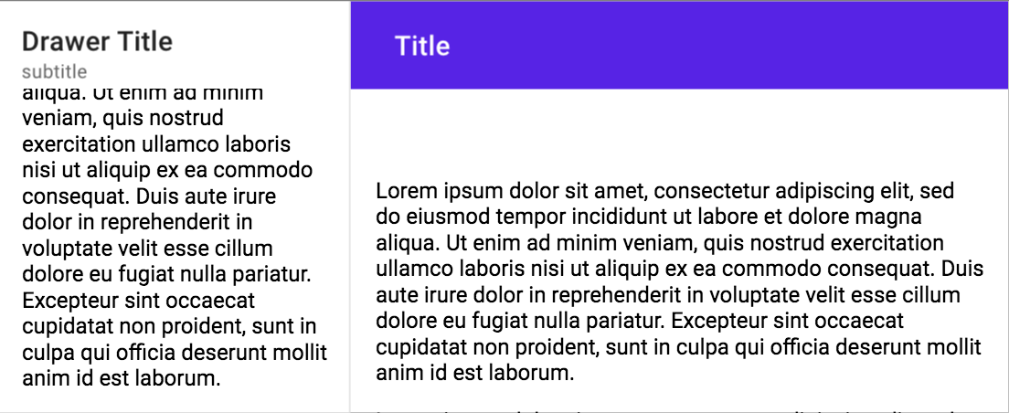
<mwc-drawer hasHeader>
    <span slot="title">Drawer Title</span>
    <span slot="subtitle">subtitle</span>
    <div>
        <p>Drawer content!</p>
    </div>
    <div slot="appContent">
        <mwc-top-app-bar>
            <div slot="title">Title</div>
        </mwc-top-app-bar>
        <div>
            <p>Main Content!</p>
        </div>
    </div>
</mwc-drawer>
Dismissible
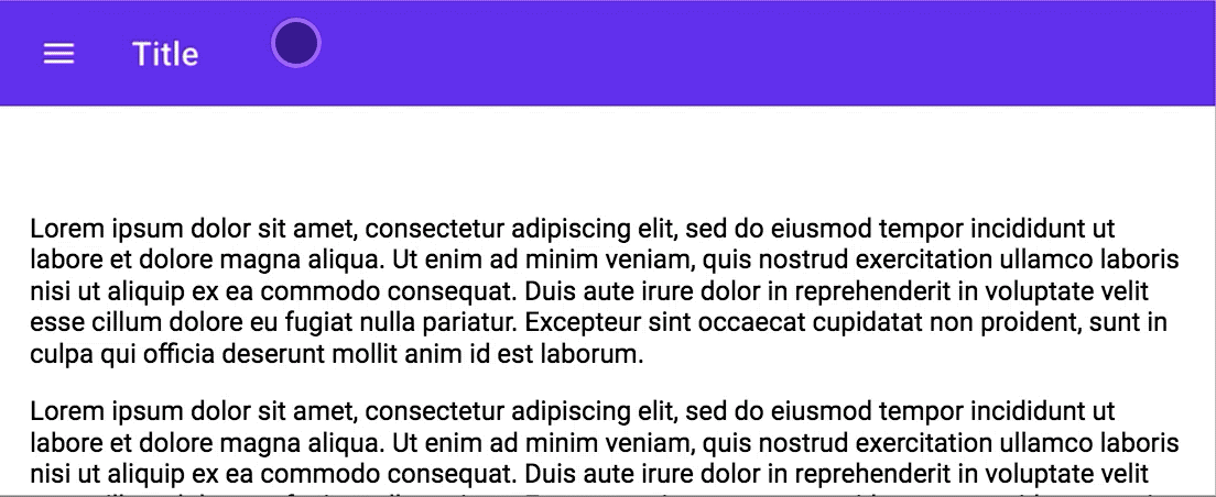
<mwc-drawer hasHeader type="dismissible">
    <span slot="title">Drawer Title</span>
    <span slot="subtitle">subtitle</span>
    <div>
        <p>Drawer content!</p>
        <mwc-icon-button icon="gesture"></mwc-icon-button>
        <mwc-icon-button icon="gavel"></mwc-icon-button>
    </div>
    <div slot="appContent">
        <mwc-top-app-bar>
            <mwc-icon-button slot="navigationIcon" icon="menu"></mwc-icon-button>
            <div slot="title">Title</div>
        </mwc-top-app-bar>
        <div>
            <p>Main Content!</p>
        </div>
    </div>
</mwc-drawer>
<script>
    const drawer = document.getElementsByTagName('mwc-drawer')[0];
    if (drawer) {
        const container = drawer.parentNode;
        container.addEventListener('MDCTopAppBar:nav', () => {
            drawer.open = !drawer.open;
        });
    }
</script>
Modal
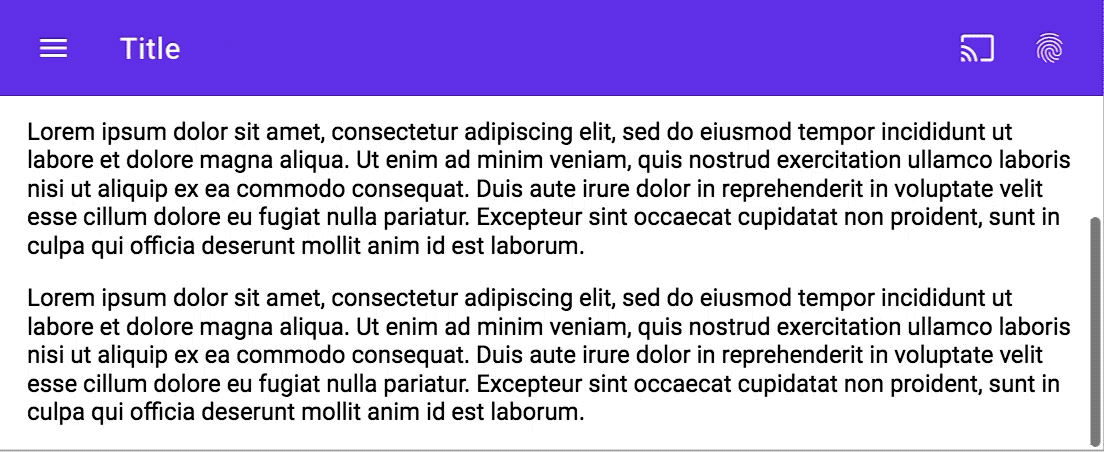
<mwc-drawer hasHeader type="modal">
    <span slot="title">Drawer Title</span>
    <span slot="subtitle">subtitle</span>
    <div>
        <p>Drawer content!</p>
        <mwc-icon-button icon="gesture"></mwc-icon-button>
        <mwc-icon-button icon="gavel"></mwc-icon-button>
    </div>
    <div slot="appContent">
        <mwc-top-app-bar>
            <mwc-icon-button slot="navigationIcon" icon="menu"></mwc-icon-button>
            <div slot="title">Title</div>
        </mwc-top-app-bar>
        <div>
            <p>Main Content!</p>
        </div>
    </div>
</mwc-drawer>
<script>
    const drawer = document.getElementsByTagName('mwc-drawer')[0];
    if (drawer) {
        const container = drawer.parentNode;
        container.addEventListener('MDCTopAppBar:nav', () => {
            drawer.open = !drawer.open;
        });
    }
</script>
API
Slots
| Name | Description |
|---|---|
title |
Header title to display in the drawer when hasHeader is true. |
subtitle |
Header subtitle to display in the drawer when hasHeader is true. |
header |
Additional header elements to display in the drawer. |
appContent |
Elements to display in the "app content" to the right of, or under, the drawer. |
| default | Elements to display under the header in drawer. |
Properties/Attributes
| Name | Type | Default | Description |
|---|---|---|---|
open |
boolean |
false |
Whether the dialog is open |
hasHeader |
boolean |
false |
When true, displays the title, subtitle, and header slots. |
type |
string |
'' |
When set to 'dismissible', overlays the drawer on the content. When set to 'modal', also adds a scrim when the drawer is open. When set to empty string, it is inlined with the page and displaces app content. |
Methods
None
Events
| Name | Detail | Description |
|---|---|---|
MDCDrawer:opened |
{} |
Fired when the drawer opens. |
MDCDrawer:closed |
{} |
Fired when the drawer closes. |
CSS Custom Properties
| Name | Default | Description |
|---|---|---|
--mdc-drawer-width |
256px |
Width of the side drawer when opened. |
Global CSS Custom Properties
This component exposes the following global theming custom properties.
| Name | Detail | Description |
|---|---|---|
--mdc-theme-surface |
The background color of the drawer. | |
--mdc-typography-headline6-<PROPERTY> |
Styles the typography of the drawer's title. | |
--mdc-typography-body2-<PROPERTY> |
Styles the typography of the drawer's subtitle. | |
--mdc-typography-subtitle2-<PROPERTY> |
Styles the typography of the drawer's list items. |